If you give me a vector file, my laser cutter tracks that art at ±0.1mm and your sign hits the shop floor for about a 15-day production run. If you give me a raster, I'm calling you back before the machine even warms up.
That's the honest answer.
Vector art is math. Lines, curves, anchor points. Raster art is pixels. That's it.
Here's what nobody tells you: most customer "vector" files are raster images saved with an .ai extension. I get that every week.
When my team takes a vector logo for front-lit channel letters, the CAD toolpath reads those exact curves. The laser cutter doesn't guess.
Raster files take a different route. The RIP software, or the printer driver, samples the pixels.
If the sample rate is too low, the sign looks soft. If the sample rate is high enough, the sign looks sharp.
Our factory in Lu'an runs a 3,000m² floor with 50+ workers, and the first thing we check on any file is whether the paths are closed and the strokes are outlined. Open paths break cutters.
Cut vinyl doesn't care about pixels. A plotter knife follows a vector path.
The ugly truth is some shops will accept a JPG for cut vinyl and then run it through auto-trace. Auto-trace gives you wobbly edges. You can see it from the parking lot.
When we rout an acrylic face for back-lit halo letters, the CNC bit follows that same vector. The acrylic face is Mitsubishi or Degussa—UV-resistant material that lets 90–92% of light through. If the path wobbles, the glow looks like a drunk trimmed it.
Print-and-cut signs need a vector contour around the raster print. That contour tells the knife where to cut after printing. If the contour's missing, somebody's on their knees hand-weeding for an hour.
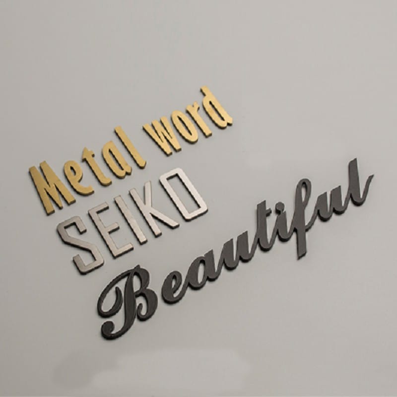
Look, vector is also what you need for any dimensional letter. Our stainless steel letters are laser-cut from 1.2–1.5mm 304 or 316 sheet. The laser holds ±0.1mm on a vector path.
That's why the base price for stainless baked-paint letters is $0.6–$0.7 per cm of letter height. That price assumes a clean vector. If I have to redraw your logo, the quote changes.
Raster only works when the file is huge and the viewing distance is long.
Here's what nobody tells you: a 6-foot lightbox viewed from across a street doesn't need 300 DPI. At 10 feet, 100 DPI looks fine.
But the same file on a 12-inch door sign looks like a YouTube video from 2006.
We build double-sided lightboxes in diameters from 40cm to 120cm. A 120cm lightbox face printed from a 72 DPI Facebook logo shows visible blocks at arm's length.
The ugly truth is raster-only sign shops will happily print that low-res JPG and call it a finished product. They know you won't check until it's mounted.
Push back if the file is less than 150 DPI at final size for anything under 3 feet wide. Ask for a PDF with the placed images at 300 DPI.
One more thing: a raster image of a transparent logo on a white background still has pixels in the "transparent" parts. That white halo will print as a faint box. You've seen it.
AI wins for most sign work. Native Illustrator files carry vector and spot colors.
PDF is what I ask for when a designer is in another city. PDF/X-4 with fonts outlined and images embedded. If they forget to outline the fonts, my software substitutes a default font. That's how a bank logo becomes Arial.
EPS is old but still works for RIP software. I don't ask for EPS unless the client is running CorelDRAW from 1998.
SVG is fine for web, but too many SVG files have unexpanded strokes and RGB colors. Sign RIPs sometimes ignore those.
JPG is only for raster prints, not cutting. PNG is worse because it's usually a screenshot at 72 DPI.
TIFF is the only raster file I'll accept for large-format print if the client has no vector. TIFF at 300 DPI and CMYK. Not PNG.
Look, if the sign has direct-to-substrate printing, color space matters. RGB JPGs look bright on a monitor and flat on a UV printer. Convert to CMYK or spot colors before you send.
The math is simple: DPI = pixels ÷ inches. A 3000-pixel-wide image printed at 10 inches is 300 DPI. Printed at 100 inches, it's 30 DPI.
Most sign shops won't tell you that because they want the job.
Here's what nobody tells you: viewing distance buys you DPI forgiveness. At 10 feet, 100 DPI is fine. At 3 feet, you want 300 DPI.
But that's for smooth-edged photographic prints. Text and logos need vector regardless of viewing distance. Even at 50 feet, a pixelated edge on a 3-foot channel letter looks wrong.
Our front-lit channel letters start with 5mm acrylic faces and aluminum returns. If the letter paths are jagged from a bad raster, the router still cuts jagged. It won't magically smooth because the sign is big.
For a floor-standing neon letter at 3ft tall, the difference between a clean vector and a traced raster is night and day. A bad trace turns a simple sans-serif into a lumpy mess.
RIP software is where files die.
The RIP rasterizes vector files for printing. It also decides where to put each droplet of ink. If your vector has a gradient mesh, transparency, or complex fill, the RIP may drop it or render it as a gray box.
The ugly truth is most "vector" branding packs from big design agencies include effects that no sign RIP can process. I've watched a 46-layer Illustrator file crash a RIP for 45 minutes before we rebuilt it from flattened shapes.
That's a $200–$400 prepress cleanup that nobody quoted.
At our factory, we run an 8–12 hour aging test on every lit sign after assembly, and 100% QC before packaging. That's after the file has survived the RIP.
So if your PDF has 12 artboards, unexpanded strokes, and a linked PSD, don't be surprised when the proof comes back with missing elements. We have to flatten, outline, and simplify. That's not us being picky. That's the machine.
Here's the flow from my side of the floor.
File confirmation takes one day. Then laser cutting, bending and welding, grinding and polishing, acrylic face CNC, LED assembly, sealing, aging test, QC, and export packaging.
If the file is a clean vector, that 10-step process runs smooth. Sample leaves in about 5 days, bulk in about 15 days.
If the file is a raster, we stop at step one. We call you. We ask for vector. You can't find it. We redraw it.
That redraw adds time, and depending on the logo complexity, it changes the quote. A simple text logo? Maybe no charge. A 4-color crest with gradients? That's prepress work.
The ugly truth is if you're importing from a factory, the file is the first quality checkpoint. Our MOQ is 1 piece, and we quote based on the actual cut path. The price in the catalog for back-lit halo letters or stainless steel letters assumes you have a vector worth cutting.
No vector, no clean cut. Simple.
Q: Can't you just use my JPG?
No. If it's for cut vinyl or channel letters, no. If it's for a large print at a distance, maybe, if it's 300 DPI at final size. Stop asking.
Q: What if my designer only works in Photoshop?
Then your designer doesn't know signs. Ask for a vector version or find someone who can redraw it. A photo of a logo is not a logo.
Q: Is a PDF always vector?
No. A PDF can contain raster images, fonts that aren't outlined, and half a dozen other problems. I need PDF/X-4 with artwork outlined.
Q: Can I send a screenshot from my website?
Only if you want a sign that looks like a screenshot from your website. Send the original .ai or .eps. Not the JPG your web guy emailed you.
Products mentioned or relevant to this topic — factory-direct, custom built.
From $16/letter · MOQ 1 piece · 7–15 day production · CE & UL certified · ships to 20+ countries
Custom sizes, colors, and finishes. Get a factory price in 24 hours.
Get a Free QuoteWhatsApp +86 13865703472 · cairuisheng@aochuangsign.cn