First, Get Your Phone Out of the Conversation
The ugly truth is that color in signage is a lie from day one.
Your laptop screen shows PMS 185. My printer spits out something vaguely related. The RAL 3020 fan deck in my booth agrees with neither. You're looking at a JPEG. I'm looking at melted plastic and metal powder. Those two worlds don't get along.
I've watched sign shops order $4,000 of
channel letters based on a color picked from a car dealership website. It never ends well.
So let's talk about what "matching" actually means on real materials — not on a monitor.
Pantone and RAL Are Not Friends
Pantone is a printing system built for ink on paper. RAL is an industrial coating standard built for powder paint and metal. They don't share the same pigment chemistry, the same gloss scale, or the same substrate. The online converters that promise "RAL 3020 = Pantone 185" are selling you a rough guess, not a match.
Those two reds are, in person, wildly different. RAL 3020 has a slight orange bite. Pantone 185 leans pink. Unless your sign is made of glossy coated paper, trying to reproduce either one without a physical chip is a recipe for an ugly surprise.
Here's what nobody tells you: The only thing that matters is a physical reference. A Pantone fan deck. A RAL chip. A piece of painted aluminum from your old sign. If you can't put a real object in front of my QC guy, he's just guessing. And I'm not going to let him guess for a "definitive" order.
Physical Materials Laugh at Your Spreadsheet
The same Pantone color looks different on gloss steel, brushed aluminum, matte acrylic, and backlit acrylic. That's not a defect. That's physics.
Take our
stainless steel letters. You don't match a color on stainless — you pick a finish. Brushed #4 catches light differently than mirror #8. If you want color on stainless, we PVD coat it or powder coat it, and both have their own gloss and texture. A color that looks deep red under a storefront canopy at noon will look black in the shade at 6 PM. I can't fight the sun.
Acrylic is even worse. Our
front-lit channel letters use acrylic faces with roughly 90–92% light transmittance. That's a clear sheet. The moment you use a colored acrylic — say, red — the light passes through it and shifts the hue entirely. A 2mm sheet of red acrylic and a 5mm sheet of the same red are two different colors because the thicker one absorbs more light. And if you backlight it? At 3000K (warm) it goes orange. At 6000K (cool) it goes purple-red. The paint chart doesn't care. I've seen this go wrong a hundred times.
What We Can Actually Match at This Factory
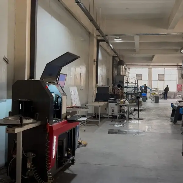
Let's start with what I can promise on a shop floor in Lu'an, Anhui.
- **Powder-coated aluminum and steel** — we can match RAL, Pantone, or a physical chip on the same metal and texture you'll get on your sign. We hold the spray-out against your reference under a standard D65 light booth, and we adjust the formula until it's visually indistinguishable at arm's length.
- **Acrylic faces (non-backlit)** — we can use colored acrylic manufacturer's samples, or we can paint the back side of clear acrylic. That paint-on-acrylic is still not a perfect Pantone match, but it's close. Then we seal it.
- **Flexible vinyl for
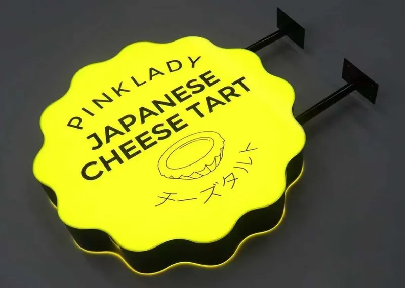
light boxes** — we don't print vinyl in-house, but we can order from a trusted supplier who uses a spectrophotometer, and we verify the roll before lamination.
- **Metal finishes** — for our
stainless steel letters and
aluminum letters, we don't match to Pantone at all. We match to a physical finish sample: brushed, mirror, PVD, or powder. You choose, and we make sure the grain direction and gloss match your sample.
That last point is critical. Color in signage is not just the pigment. It's the surface texture, the light, and the backing material. Anyone who promises an exact Pantone match on a sheet of 3mm acrylic with 6000K LEDs behind it is either delusional or lying.
Brutal Honesty #1: The PDF Is Worthless
Here's what nobody tells you: Your PDF, your JPG, your screenshot from Instagram — none of those carry color profile information that survives email. We get files every week with sRGB, AdobeRGB, and CMYK mixed together, all claiming to be "true red."
If you don't send us a physical chip or a valid RAL/Pantone fan deck number, we'll still make your sign, but you're buying a coin flip. We won't guarantee a match. And don't get upset when we ask you to pay for a physical color sample. It's not upselling. It's due diligence.
The Sample Process You Should Demand
I'll tell you exactly how we do it, because I want you to hold us to it.
1. You send us the physical color reference — a painted metal panel, a RAL chip, even a piece of your old sign. If you can't send one, we'll ask you to order a physical fan deck online. It costs you fifty bucks and saves a thousand in rework.
2. Our workshop produces a small spray-out — roughly 10cm × 10cm — on the exact material that will go into your sign. Same gauge aluminum, same stainless steel grade, same acrylic thickness.
3. We let it cure for a full day, then we compare it to your reference under a calibrated light source. This isn't eyeballing. We use a spectrophotometer to read both panels, and we look at the delta E reading to see how far off we are.
4. We send the spray-out to you by express courier. You hold it next to your own chip. If it's not right, we adjust and re-spray. Once you sign off, that panel is our production standard. We keep it in the QC station and verify every batch against it.
It costs extra, and it takes 7–10 days. For a single sign? Fine. For a nationwide retail rollout with 40 locations? It's the only professional way.
Brutal Honesty #2: We Can't Match That Sign in Your Head
I'll give you a list of things we won't promise.
- We can't match a Pantone color on
brass letters or copper letters. That's real metal. The color is the alloy. You want "antique brass"? That's a chemical patina applied in sections, and every letter will age slightly differently. That's the point. If you want a uniform painted look, order aluminum, not brass.
- We can't match a backlit acrylic face to a front-lit paint sample. The light source changes everything. On
backlit halo letters, the color you care about is the glow, not the face. The face can be dark purple, but with the right LEDs it turns violet. If you don't accept that, you're going to have a bad time.
- We can't match a supplier's logo that was printed on a banner. Banner vinyl uses dye-sublimation, not paint. It's a completely different pigment universe.
- We can't reverse-engineer a color from a hex code printed on your website. A hex code is three numbers. The physical world has at least five variables — pigment, binder, substrate thickness, gloss, and ambient light. I need more than three numbers.
LED Color Temperature Is Half Your Color Problem
Stop obsessing over the Pantone number and start thinking about what light is hitting your sign.
For
dual-lit channel letters — where you see both the face and the halo — the LED temperature determines whether your white letters look warm ivory or clinical blue. The color of the front face, if it's translucent, will shift with that LED.
Here's the rule I've used for years:
- 3000–3500K if the sign is for a restaurant, hotel, or anything "feeling" driven. It softens reds and oranges, gives everything a rich amber glow.
- 4000–5000K for retail, corporate, or any clear brand color. It's the most honest neutral.
- 6000–6500K for industrial, highway, or anything that needs to punch through distance. It makes blues and greens sharper, but it will turn a warm red muddy.
If you're comparing our
acrylic light boxes, the same face material will look completely different with a 3200K module versus a 5500K module. We'll ask you what feeling you want before we quote you. That's not a delay — that's me saving you from a $2,000 mistake.
What Your Buyers' Contract Should Say
I can't write your contract for you, but I can tell you what the professional sign buyers demand from us.
- They require a physical sample, signed and stored.
- They specify the exact material thickness and finish in the PO.
- They define the lighting color temperature in Kelvin, not in "bright white."
- They accept a tolerance of "visually indistinguishable under D65 lighting at 18 inches" instead of "exact Pantone match." Because exact doesn't exist.
If your sign shop tells you they've never needed a physical sample, run. If they tell you a hex code is enough, find another shop.
The Honest Bottom Line
Look, I run a 3,000m² factory. I've shipped worldwide. I don't need to trick you into a signed PO. I need you to know exactly what color you're buying, in the real world, on the metal or plastic that will hang over your door for the next decade.
A physical sample costs a little money and a little time. A mistmatched sign costs a lot more. I've watched sign shops pay $800 for a front-lit letter. Same 304 stainless, same Samsung LEDs. We ship that letter for $120 — but we still make you approve the color sample first.
That's not a factory being difficult. That's a factory that wants you to call us back in three years when the sign still looks right.