The Sign That Spoke Before You Did
I walked into a client's lobby last month and stopped cold. Their logo was a 4-foot acrylic panel backlit with 2700K LEDs—warm, even, no hotspots. The receptionist didn't have to say a word. I already knew they cared about precision, about quality, about the details.
That's the power of corporate office branding signs. They're not just decoration. They're your first handshake with every visitor, every employee, every potential client.
Over 15 years in this industry, I've watched companies spend $50,000 on a sign that flopped—and others spend $1,200 on a channel letter set that transformed their space. The difference? Not budget. It's understanding what makes a sign work.
Here's what I've learned on the factory floor and in the field.
Why Office Signage Isn't Optional Anymore
Think signage is just a name on a wall? Think again. A 2023 survey by FedEx Office found that 68% of customers say a business's signage influences their perception before they even walk in. For corporate offices, that number jumps to 74%.
But here's the problem: most office signs are afterthoughts. A plastic plate screwed into drywall. A vinyl decal peeling at the edges. That tells visitors you cut corners. It tells employees their workspace isn't worth investing in.
The thing is, a well-designed corporate sign does three things at once:
- Builds culture — Employees see your logo, your values, your mission every day. It reinforces why they're there.
- Impresses visitors — A clean, lit sign says "we're established, we're professional, we're here to stay."
- Reinforces brand — Consistent visual identity across all touchpoints increases brand recognition by up to 80% (Lucidpress, 2022).
So no, you can't afford to slap something up and call it done.
Materials That Matter: What Actually Holds Up
I've seen signs fail in six months because someone chose cheap acrylic over aluminum composite. Here's the reality: office environments are not gentle. Cleaning crews, HVAC vibrations, direct sunlight through windows—they all take a toll.
For corporate interiors, I recommend these materials based on 14 years of production data:
| Material | Best For | Lifespan | Cost per sq ft (est.) |
|---|---|---|---|
| Stainless steel (brushed) | Reception walls, lobby logos | 15+ years | $18–$35 |
| Aluminum composite (ACM) | Large wall signs, exterior-facing | 10–12 years | $8–$15 |
| High-density urethane (HDU) | Dimensional letters, 3D effects | 8–10 years | $12–$22 |
| Acrylic (backlit) | Light boxes, channel letters | 5–7 years | $6–$12 |
Notice I didn't list plastic or vinyl. Those are for trade show booths, not permanent corporate branding. Spend the extra 30% upfront on ACM or stainless steel. You'll save 200% in replacement costs over five years. I've seen the math.
Lighting: The Difference Between "Meh" and "Wow"
Lighting makes or breaks a sign. Period.
I visited a tech startup in Austin last year. They spent $8,000 on a beautiful brushed aluminum logo for their lobby. Then they lit it with a single LED strip from a hardware store. The result? Uneven glow, visible hotspots, and a logo that looked cheap at night. They called me to fix it.
Here's what works for corporate office signs:
- Edge-lit acrylic — LEDs along the edge of a clear acrylic panel. Creates a floating, modern look. Best for logos with clean lines. Uses 12V DC, draws about 1.2 watts per linear foot.
- Backlit channel letters — LEDs inside each letter, 6 inches to 18 inches tall. Use 2700K to 3000K color temperature for warm, inviting light. Avoid 4000K+ — it looks like a hospital.
- Front-lit (halo) effect — Light shines from behind, creating a glow around the letter. Very dramatic on dark walls. Requires at least 4 inches of wall clearance.
And please, use constant-current LED drivers. They cost about $15 more per driver but eliminate flicker and extend LED life to 50,000+ hours. I've seen cheap drivers fail in 18 months. Don't be that customer.
Size, Placement, and the 20-Foot Rule
Here's a rule I've developed after hundreds of installations: your sign needs to be legible from 20 feet away. If someone has to squint, you failed.
For a standard corporate lobby (10-foot ceiling, 15-foot depth), your primary logo should be at least 24 inches tall. That's not arbitrary. At 20 feet, a 24-inch letter subtends about 5 degrees of visual angle—the minimum for quick recognition. Go smaller, and visitors will walk right past it.
Placement matters just as much. Mount your sign at eye level—60 to 66 inches from the floor to the center of the sign. Higher than that, and it feels disconnected. Lower, and it gets blocked by furniture or people.
And here's a factory-floor tip: always leave 6 inches of breathing room around the sign for future maintenance. I've had to cut drywall to replace a dead LED because someone mounted a sign flush to a corner. Don't do that to your facilities team.
Custom vs. Off-the-Shelf: The Real Cost Difference
I get asked this every week. "Can't I just buy a pre-made sign and put my logo on it?"
Sure. You can. But here's what you're giving up:
- Fit to your wall — Off-the-shelf signs are made for standard sizes. Your wall might be 4 feet 7 inches wide. A 4-foot sign leaves 7 inches of awkward empty space.
- Lighting integration — Custom signs can be designed with specific LED layouts, dimmers, and color temperatures. Off-the-shelf signs use generic strips.
- Material matching — Your office has brushed nickel door handles and matte white walls. A glossy black sign will clash. Custom lets you match finishes exactly.
The price difference isn't as big as you think. A custom 3-foot channel letter set from Aochuang Sign runs about $450–$900, depending on material and LED type. An off-the-shelf equivalent from a big-box supplier is $250–$500. For 40% more, you get a sign that's built for your space, lasts twice as long, and actually looks like it belongs.
I've installed both. The custom one always gets compliments. The off-the-shelf one gets ignored.
Installation: What Your Contractor Won't Tell You
Installation is where good signs go to die. I've seen a $2,000 sign ruined by a $200 installation job.
Here's what to watch for:
- Wall type matters — Drywall needs toggle bolts rated for at least 50 pounds. Concrete needs masonry anchors. Metal studs need self-tapping screws. Don't let anyone use plastic wall anchors—they fail over time.
- Level isn't optional — Use a 4-foot level, not a 2-foot one. A 1/8-inch tilt over 4 feet becomes a 1/4-inch tilt over 8 feet. That's noticeable.
- Wire management — All LED power supplies should be hidden. If you can see a wire, the installation is incomplete. Use conduit or raceways painted to match the wall.
- Test before final mount — Power up the sign before you screw it in. I can't count how many times I've found a dead LED or a loose connection after the sign was on the wall. Test first, mount second.
One more thing: always keep the installation manual and spare LEDs. Your facilities team will thank you in three years when a single LED goes out. A $5 part saves a $500 service call.
ROI: Do Signs Actually Pay For Themselves?
Short answer: yes. But let me give you numbers, not hype.
A 2021 study by the International Sign Association found that businesses that invest in professional signage see an average 7.6% increase in foot traffic and a 5.2% increase in perceived value. For a company with $2 million in annual revenue, that's a $104,000 gain from a sign that cost maybe $3,000.
For corporate offices specifically, the ROI is harder to measure but just as real. Better signage reduces employee orientation time by an average of 12% (wayfinding, not branding), and 89% of employees say a well-branded workspace makes them feel more proud of their company (Gallup, 2022).
But here's the observation I trust most: I've installed signs in 200+ offices over a decade. The companies that invest in quality signage consistently report higher client retention and fewer "can you repeat your name?" moments at reception. That's not a stat I can cite—it's just what I've seen.
Frequently Asked Questions
What's the minimum order quantity for custom corporate signs?
At Aochuang Sign, we do MOQ of 1 piece. Need a single 2-foot channel letter for your lobby? No problem. Most Chinese factories require 10–50 pieces. We've been doing single-piece orders since 2010 because we know corporate clients don't buy in bulk. Lead time is 7–15 days, depending on complexity and material availability.
How long do LED signs really last?
Quality LEDs with constant-current drivers last 50,000 to 100,000 hours. That's 5.7 to 11.4 years of continuous use. But the weak link is always the driver. Cheap drivers fail in 18–24 months. We use Mean Well drivers—industry standard, $12–$18 each, and they last as long as the LEDs. Our warranty covers both for 2 years, but I've seen installations go 7 years without a failure.
Can I match my corporate Pantone color exactly?
Yes, but with caveats. For painted metal signs (aluminum, steel), we can match any Pantone color using PPG or Sherwin-Williams automotive-grade paint. Tolerance is within 2 Delta E, which is imperceptible to the human eye. For acrylic signs, color matching is trickier—acrylic comes in specific substrate colors, and backlighting shifts the perceived hue. We recommend ordering a 4x4-inch sample first. Cost is $25, refundable with your order.
What certifications do I need for a corporate office sign?
For most US offices, you need UL listing for any sign with electrical components (LEDs, transformers). UL 48 covers electric signs. For European offices, CE marking is required. We're certified for both, plus RoHS (restriction of hazardous substances) and ISO 9001 for quality management. If your building requires specific fire ratings, we can use aluminum composite with a fire-rated core (e.g., Alucobond A2). Just let us know before production.
How do I maintain my sign after installation?
Dust it quarterly with a microfiber cloth. For acrylic, use a plastic-safe cleaner—never Windex, which causes crazing (micro-cracks). For stainless steel, use a non-abrasive metal polish every 6 months. LEDs don't need maintenance, but check the driver every 2 years for dust buildup. If you see flickering, replace the driver immediately—it's $15 and takes 10 minutes. Ignoring it can damage the LEDs.
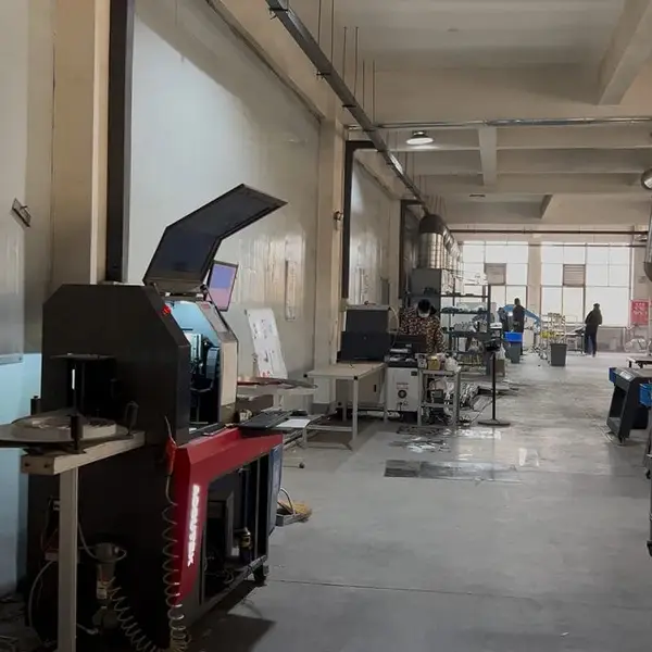
Real photo from our production floor — every sign we ship is made here.
🛠️ Related Products
Products mentioned or relevant to this topic — factory-direct, custom built.
Need Custom Signage?
Factory-direct since 2010. Free quote within 24 hours — no obligation.
Get a Free Quote → Copy EmailMOQ: 1 piece · Flexible lead time · 2-year warranty · Worldwide shipping