You can’t compare a light beam to a painted rock.
Pantone is a proprietary system built for ink on paper and textiles. Over 2,000 spot colors, coated and uncoated, used by graphic designers everywhere. RAL originated in Germany for industrial coatings. 200-odd colors, mostly solid, with a few metallics thrown in. Neither system was designed for illuminated signage, where the substrate swallows half your hue and the LED pumps the rest into a different dimension. I’ve spent 16 years on the factory floor watching that translation fail because nobody factored in how 3mm white acrylic diffuses 90-92% of the light but shifts the wavelength slightly toward yellow.
Physical reality trumps every swatch book every time. Stainless steel reflects ambient light back through a translucent coating. Acrylic has its own native tint. Even 316 marine-grade steel holds powder differently than 304. You can match chips all day in an office. I match things that hang 20 feet above a sidewalk under sodium vapor lamps and Texas sun.
Substrate eats color.
When you powder coat a Pantone-matched polyester onto 304 stainless, the metallic base bounces photons back through the pigment layer. That red you picked from a coated swatch suddenly picks up a warm, coppery undertone. It’s not a mistake — it’s physics. We saw it last month on a set of 24-inch channel letters for a Houston restaurant: PMS 186C on aluminum versus stainless yielded a Delta E shift of 3.8. The aluminum stayed truer. The stainless read as brick. We shot samples, the client chose the cheaper aluminum, and everyone slept fine. Here’s what nobody tells you: anodized aluminum can’t hit an exact Pantone. The electrochemical process only supports a limited color range, usually with a metallic base. We can get within 5 Delta E on a good day, and we’ll tell you that before you spend a dime.
For front-lit channel letters, the acrylic face becomes the canvas. Clear acrylic with translucent vinyl will reflect the LED’s spectral peak. A 2700K warm white module behind a PMS 2995C blue will read teal at night. I’ve seen this go wrong: a Chicago chain ordered backlit halo letters in PMS 280C navy. Beautiful dark blue during daylight. At dusk, their 6500K cool white LEDs fired up and that navy washed out to a weak electric blue, completely off-brand. Nobody told them that backlighting eliminates surface reflectivity, leaving only the transmitted color filtered through a blue-tinted acrylic. We warned them, they overrode, they paid for a rebuild. We keep that photo in the office.
Color temperature is the silent killer.
A 3000K LED will make any white acrylic face look creamy. 6000K turns it surgical. But it’s sneakier than that. The SMD 2835 chips we use push 100-150 lumens per watt, yet their spectral distribution isn’t flat. There’s a blue spike around 450nm that excites fluorescent pigments in red and orange vinyls, making them seem more intense under 5000K than under 3500K. That means a PMS 021C orange on a clear acrylic face with 4000K LEDs looks punchy, but switch to 3000K and it dulls to a pumpkin. We test every sign with the actual LED module and temperature the customer specifies. When a shop sends an order for a PMS 7548C warm yellow on a backlit sign with 6500K modules, I pick up the phone. It’ll shift green under cool light. We’ll offer a 4000K neutral alternative and shoot them comparison photos on our aging rack.
Look, I’ve seen guys obsess over a Pantone chip under a D65 lightbox and then install their sign in a hallway lit by 2700K halogen. The $80,000 brand identity they were protecting evaporates. The ugly truth is perfect color matching only exists in a controlled lab, not on Main Street at 7 PM. That’s not a defect; it’s a consequence of real-world physics.
We need a physical target. A Pantone swatch, an RAL fan deck, or a chunk of painted metal. Sending an RGB screenshot is like trying to bake bread from a picture of flour — we’ve had that argument more times than I can count. A cellphone screen uses additive color; a powder-coated letter uses subtractive pigment. They will never match. We charge $25 to order the chip ourselves and we’ll buy it from Pantone or RAL, not a print shop.
Once we get the target, the factory process is simple and unsexy. Our supplier mixes polyester powder for metal or custom blends vinyl ink for acrylic faces. We spray a sample on the exact substrate — 1.5mm 304 stainless for a stainless steel letter, 3mm Mitsubishi acrylic for a front-lit face. Then we bake or cure it and put it under a D65 lamp and an A-lamp side by side. We measure with a spectrophotometer; if Delta E is under 2.0 against the chip, we ship a photo to the client. For metal letters, a Delta E of 1.0-1.5 is routine with RAL colors because the powder bases are standardized. Pantone solid colors land at 1.5-2.5 on a good day. Fluorescents, neons, and pastels? Forget it. The pigments don’t exist in durable outdoor powder. We’ll say no rather than sell you something that fades to chalk in 18 months.
Here’s the brutal truth: if you demand a metallic finish that matches PMS 877 C silver exactly, we’ll tell you to choose a physical metal finish. Brushed stainless, mirror-polished, or PVD coating are not Pantone colors. A PVD coating is a vapor-deposited ceramic layer; it’s gorgeous and durable, but it comes in the factory’s standard champagne, gold, or black. You don’t get to pick a PMS callout for it. Some shops promise “custom PVD matching” — they’re lying or charging so much they’ll hand-spray a tinted clear coat that will peel in two Florida summers.
For acrylic light boxes with digitally printed faces, we can hit Pantone colors on the translucent film with decent accuracy because the inkjet process uses CMYK+White. But the internal LED color temperature still alters the perceived hue. We’ll print a 12-inch sample, mount it on the same silver frame, and light it up with your chosen modules. That sample costs about $50 and saves you a $2,000 mistake.
We can match RAL classic colors to powder coat on aluminum or stainless steel within a Delta E of 1.5, verified with a calibrated meter. Our polyester powder is UV-stable, rated for 8-12 years on aluminum and 10+ on 304 stainless. We can match the majority of Pantone solid coated colors, but we will always explain the metamerism risk. If a color looks off under office fluorescents but correct outside, that’s not a defect; it’s the illuminant. We document that in the pre-production sample.
We cannot match any Pantone pastel that relies on a white base if your substrate is dark metal. The white undercoat will add thickness, soften edge detail on fabricated letters, and still fight the dark background. We recommend switching to aluminum for light colors. We cannot match metallic Pantones or effects like Pantone 8400 C bronze shimmer to a single-stage powder. We can use a two-coat system for some pearlescent effects, but the cost jumps 25-40% and the minimum order per color is 20 kg of powder. If you need that shimmer, we’ll offer a PVD coating or a brushed surface as an alternative.
On acrylic faces for rimless or front-lit letters, we can screen print translucent Pantone-matched ink onto clear 3mm acrylic, but the color will shift when lit. We’ll send you a lit photo from our aging test bench where we run every sample for 8-12 hours at full power. If you hate it, we try a different ink density or suggest a pre-colored acrylic sheet from Mitsubishi. Their reds, blues, and greens are beautifully consistent, though the palette is limited to about 25 colors. It doesn’t cover every PMS fantasy.
Custom color matching isn’t free. For a small order — say, a single 18-inch stainless letter in a custom PMS 300C blue — the powder matching fee and minimum powder purchase can add $25-40 to a letter that would otherwise cost $35. We’ll tell you that upfront. For a whole storefront set of 20 letters, the powder cost gets amortized and the premium per letter drops to $5-8. Same goes for custom screen-printing screens for acrylic faces. We keep the screens for up to 2 years, so reorders get cheaper. A standard aluminum letter might leave our factory at $15-20; a custom-matched, UV-coated version with a unique Pantone can hit $35-40. That’s still 50-65% less than a US shop’s installed price, but don’t let the low base price fool you — customization costs because we refuse to cut corners on materials. We’ve seen factories slap cheap liquid paint on metal and call it “matched.” Their finish fails in 18 months. We use outdoor-rated polyester; ask for the warranty card.
Sea freight takes about 65 days from our Lu’an factory to your door. Air freight is faster but costs $4-12 per kg. Add the 30% US Section 301 tariff on top of product value. None of that changes how color works. What it changes is how much risk you can stomach on a batch of signs that don’t match. So here’s our rule: we never start production without a signed physical sample approval or a color waiver. We’ll ship you a 6-inch scale model of your front-lit channel letter or a powder-coated metal plaque. You see it in your conference room, hold it up to your wallpaper, see how it looks at 5 PM with the blinds open. That $80 sample is the cheapest insurance you’ll ever buy.
Look, I’ve had an Australian client reject a whole sea container of halo-lit letters because the blue looked “too warm” under their office LEDs. They’d approved a digital photo, not a physical sample. That cost them $18,000 and six weeks of delay. We could have prevented it with a $90 FedEx parcel. Don’t be that guy. Color matching is a dance between material, light, and perception, and the only judge that matters is your eyeball on the actual object.
We have 3,000 square meters of floor space, 50 workers, and ISO 9001 certification that means our process is repeatable. But repeatable doesn’t mean magical. It means when you order those stainless steel letters in RAL 7016 anthracite, we’ll produce the same color next year as we do today, within a tolerance you can measure. That’s worth more than a perfect Pantone that exists only in a swatch book.
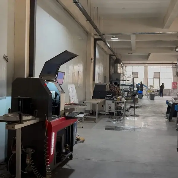
Real photo from our production floor — every sign we ship is made here.
From $24/letter · MOQ 1 piece · Flexible lead time · CE & UL certified · ships to 20+ countries
Custom sizes, colors, and finishes. Get a factory price in 24 hours.
Get a Free Quote Copy EmailWhatsApp +86 13865703472 · business@aochuangsign.cn
See pricing, specs, and get a free quote for the sign type you need. Built in our factory, shipped worldwide.