Pharmacy Drugstore Exterior Signage: Mastering Medical Retail Compliance & Visibility for Sign Shops

The Hidden Cost of Getting It Wrong

I’ve seen it too many times. A sign shop lands a big pharmacy chain contract. They rush the install. Then the city inspector shows up. The sign is too bright for the medical overlay district. Or the braille on the ADA sign is mounted at 59 inches instead of 60. Suddenly, you’re facing a $10,000 fine and a full redesign. And the pharmacy chain is calling your boss, not the zoning board.

Here’s the reality: most sign shops focus on making pharmacy signs “pop” for retail appeal. But the real profit—and the real loyalty—comes from mastering the hidden regulatory maze. The intersection of FDA drug labeling rules, ADA accessibility standards, and local sign codes is where you either win or lose.

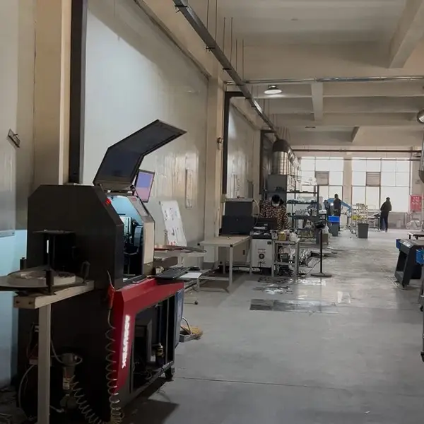
At Aochuang Sign, we’ve shipped signs to 21+ countries from our 3,000m² facility in Lu’an, Anhui. We’ve seen the difference between a sign that gets approved in 7 days and one that sits in permit limbo for 3 months. The difference is compliance knowledge. This article will give you that knowledge—specific numbers, real specs, and factory-floor wisdom you won’t find in a marketing brochure.

ADA Compliance: The Non-Negotiable Foundation for Exterior Pharmacy Signs

Every exterior pharmacy sign that includes text or directional information must meet ADA Standards for Accessible Design. This isn’t optional. It’s federal law under the Americans with Disabilities Act. And pharmacies are frequent targets for ADA lawsuits because they’re public accommodations.

Here are the specific requirements you need to know:

  • Mounting height: Tactile signs (with braille and raised characters) must be mounted between 48 inches and 60 inches from the finished floor to the baseline of the lowest braille cell. This applies to prescription drop-off signs, pharmacy entrance signs, and directional signs.
  • Character height: For exterior signs viewed from a distance, ADA requires minimum 5/8 inch for signs mounted 48-60 inches high. But for pharmacy name signs meant to be read from the street, you’ll need much larger—typically 6-12 inches depending on speed limit. We’ll cover that later.
  • Contrast: Characters and braille must have a minimum 70% light reflectance contrast between text and background. That means no light gray letters on a white acrylic face. Use high-contrast color pairs: white on dark blue (Walgreens blue), or white on dark red (CVS red).
  • Non-glare finish: All sign surfaces must have a non-glare or matte finish. Glossy acrylic reflects light and makes reading impossible for someone with low vision. Use etched or matte-finished acrylic.
  • Grade 2 Braille: Braille must be Grade 2, domed, and spaced according to ADA standards. No shortcuts. We use CNC engraving for precise dot placement—tolerance of ±0.1mm.

Factory-floor wisdom: When we produce ADA-compliant signs for pharmacy chains, we use 3mm acrylic with UV-resistant coating for the face. The braille is CNC-engraved, not painted. Painting braille is a lawsuit waiting to happen—the dots wear off in 6 months. CNC engraving lasts the life of the sign.

Illumination Types: Balancing 24-Hour Visibility with Local Light Pollution Laws

Pharmacy signs need to be visible 24/7. But many medical districts have strict light pollution ordinances. You can’t just slap a 10,000-lumen floodlight on a pylon sign and call it done.

Here’s what works in medical retail environments:

Illumination TypeBest ForLight OutputCompliance Risk
Front-lit LED channel lettersStandalone pharmacies, high-speed roadsSMD 2835 LEDs: 100-150 lm/WLow—easy to dim or shield
Back-lit halo (reverse channel)Medical plazas, strip malls, low-light zonesSMD 2835 or 5050: 80-120 lm/WMedium—glow can spill into residential areas
Internally illuminated cabinetsPylon signs, monument signsSMD 5730: 40-60 lm/chipHigh—must comply with max candela/m²
Neon flex (LED simulated neon)Window decals, accent signs30-200 lm/ft depending on diameterLow—small footprint

Key numbers to know: For medical districts, many municipalities cap illuminated sign brightness at 50-100 candela per square meter (cd/m²) after 10 PM. A standard front-lit channel letter with SMD 2835 LEDs at 100 lm/W can easily hit 300 cd/m². You need dimmers or shielding. We install potentiometer dimmers on all pharmacy signs for this exact reason—it costs us $15 per sign and saves clients thousands in permit fees.

For drive-thru signs, use back-lit halo letters. They provide clear visibility without the glare that distracts drivers. SMD 5050 RGB modules work well here—they can switch to warm white (3000K) at night to reduce light pollution.

Factory-floor wisdom: Cheap LED modules from unknown brands fail in 12-18 months. We use Samsung or Osram chips rated L70 ≥50,000 hours. That’s 5+ years of real-world performance. For a pharmacy chain, relighting a 20-foot pylon sign costs $2,000-$5,000. Don’t be the shop that has to do it twice.

Material Selection: Surviving the Medical Environment

Pharmacy exteriors are harsh environments. Sun. Rain. Road salt. Cleaning chemicals. And the sign needs to look perfect for 5-10 years. Here’s what we recommend based on 15 years of manufacturing:

  • Aluminum (0.063” or 1.6mm): Best for sign cabinets, backplates, and structural frames. Naturally rust-proof. 8-12 year outdoor life. Weight is 1/3 of steel, so it’s easy to install. Powder coat or anodize for color matching.
  • Stainless steel 304 (1.0-3.0mm): For premium channel letters and halo-lit signs. 10+ year outdoor life. Contains 18% chromium and 8% nickel. Use brushed #4 finish for non-glare. Mirror #8 finish looks great but shows every fingerprint—avoid near prescription counters.
  • Stainless steel 316 (2-3% molybdenum): For coastal pharmacies or industrial zones. 15+ year marine grade. Costs 20-30% more than 304, but worth it when salt spray is a factor.
  • Acrylic (Mitsubishi or Degussa): For sign faces. 90-92% light transmittance. UV-resistant grades last 5-8 years. Domestic acrylic yellows in 1-2 years. Use 5mm for faces over 2.5 meters to prevent sagging.
  • Polycarbonate (Lexan): For impact-prone areas like drive-thru menu boards. 250x stronger than glass. But it scratches easily—use a hard-coat grade.

Color matching tip: Pharmacy chains are fanatical about brand colors. Walgreens blue is PMS 2945. CVS red is PMS 186. We match these using powder coating with a spectrophotometer. Tolerance of ΔE ≤ 1.5. Don’t trust your eyes—use a color reader. We’ve rejected 20% of powder coating batches because they were 2 units off.

Digital Signage Integration: Prescription Ready Alerts on Exterior Displays

More pharmacy chains are adding digital message centers to display “Prescription Ready” alerts, wait times, and promotions. But this introduces a whole new layer of compliance risk.

The rules:

  • No flashing lights near emergency exits: Most fire codes prohibit flashing or strobing signs within 15 feet of any emergency exit. That includes digital message boards that cycle content faster than 5 seconds.
  • No misleading health claims: FDA regulations prohibit exterior signs from making unsubstantiated health claims. You can’t say “Cures COVID” or “Boosts Immunity.” Keep it to operational messages: “Prescription Ready,” “Drive-Thru Open,” “Flu Shots Available.”
  • Brightness limits: Digital signs in medical districts are often capped at 5,000 nits during the day and 500 nits at night. Use auto-dimming sensors. We install photocell-controlled dimmers on all digital pharmacy signs—costs $200 per sign but prevents fines.
  • Content freeze during emergencies: Some municipalities require digital signs to freeze on a static message during emergencies (e.g., “Pharmacy Open” only). Check local codes.

Case study: We manufactured a 4ft x 8ft digital message center for a pharmacy chain in a medical plaza. The local code required the sign to auto-dim to 300 nits after 9 PM and cycle content no faster than every 10 seconds. We programmed the controller to comply. The sign passed inspection on first try. The competitor’s sign next door didn’t—they had to pay $8,000 for retrofitting.

Zoning Variances: Navigating Medical Overlay Districts

Medical overlay districts are special zoning zones around hospitals, clinics, and medical plazas. They have stricter sign rules than general commercial zones. And they vary wildly by city.

Common restrictions in medical overlay districts:

  • Maximum sign area: Often 50-100 square feet total, compared to 200+ square feet in general commercial zones.
  • Maximum height: 15-20 feet for monument signs. Pylon signs are often banned entirely.
  • Illumination: External illumination only in many medical districts. No internal illumination or digital displays. Some allow halo-lit letters as a compromise.
  • Setback requirements: Signs must be set back 10-20 feet from property lines in medical zones, compared to 5 feet in commercial zones.

How to win a zoning variance:

When a pharmacy chain wants a 100-square-foot pylon sign in a medical district that caps at 50 square feet, you need a conditional use permit. Here’s the strategy:

  • Argue visibility for patient safety: Pharmacy signs help people find medication quickly. That’s a public health argument. It works.
  • Offer reduced illumination: Propose dimming to 50 cd/m² after 10 PM. Cities love this concession.
  • Use non-glare materials: Promise matte finishes and shielded LEDs. Show them you’ve thought about light pollution.
  • Provide a photometric plan: A simple diagram showing light distribution. We use free software to generate these. Takes 2 hours. Saves 2 months of permit delays.

Real example: A pharmacy in a medical plaza wanted a 60-square-foot monument sign. The code allowed 40 square feet. We applied for a variance, offering to reduce the sign height from 12 feet to 10 feet and use only halo-lit letters (no internal cabinet). The variance was approved in 6 weeks. The chain was thrilled—they’d been quoted 12 weeks by another shop that didn’t know the process.

Readability from the Street: Minimum Font Sizes and Viewing Distances

You can have the most compliant sign in the world. If nobody can read it from the road, it’s a waste of money. Here are the minimum font sizes for pharmacy name signs based on speed limits:

Speed Limit (mph)Minimum Letter Height (inches)Viewing Distance
256300 ft
358400 ft
4510500 ft
5512600 ft
6514700 ft

Note: These are minimums. For pharmacy chains, we recommend going one size up. A 12-inch letter at 45 mph is readable at 500 feet. But if there’s a tree or a pole in the way, you lose visibility. Go to 14 inches for buffer.

For drive-thru directional signs, use 4-inch minimum letters. The driver is stopped or moving slowly. But the sign must be readable from 50 feet—that’s the typical distance from the menu board to the order point.

Font choice matters: Sans-serif fonts (Helvetica, Arial, Frutiger) are more legible at distance than serif fonts. And avoid condensed fonts—they save space but kill readability. We use a custom sans-serif font for all pharmacy signs. It’s wider than standard, with 20% more spacing between letters.

Permit Checklists: What You Need Before You Start

Every pharmacy sign needs a permit. Here’s the checklist we send to every client before we start manufacturing:

  • Site plan: Show sign location, setbacks, and distances to property lines. Scale 1:100 or 1:200.
  • Elevation drawing: Front and side views with dimensions. Include letter height, sign area (sq ft), and mounting height.
  • Photometric plan: Light distribution diagram. Show brightness in cd/m² at 10 ft intervals.
  • Structural calculations: Wind load analysis for your region. Most cities require 90-120 mph wind rating for signs.
  • Material specifications: List all materials (aluminum gauge, acrylic thickness, LED type). Include UL/ETL certification if required.
  • ADA compliance statement: For any tactile signs, include a note that braille and characters meet ADA standards.
  • Color samples: Physical or digital color chips matching pharmacy brand standards. Use PMS numbers.
  • Electrical diagram: For illuminated signs. Show wiring, dimmers, and disconnect location.

Pro tip: Many cities now accept digital submissions. We send everything as a single PDF under 10 MB. Include a cover letter explaining why the sign meets all local codes. Reference specific code sections. It shows you’ve done your homework.

Shipping and Tariffs: What Importers Need to Know

If you’re importing pharmacy signs from overseas, factor in the US Section 301 tariff (roughly 30% on fabricated metal signage from China). Here’s a real cost breakdown:

Shipping MethodTransit TimeCost RangeBest For
Express (DHL/FedEx)7-15 days$30-100 for small packagesSample signs, small orders
Air freight10-20 days$4-12/kgMedium orders (100-500 kg)
Sea freight (LCL)50-70 days$80-200/m³Large orders (1-10 m³)
Sea freight (FCL)50-70 days$1,200-3,000 per containerFull container loads (20+ m³)

Factory pricing comparison: A front-lit channel letter from Aochuang Sign costs $20-80 per letter. The same letter installed in the US retails for $200-700. That’s a 50-65% savings on product cost. Even with the 30% tariff and shipping, you’re still saving 30-40% total.

But here’s the catch: you need to order at least 7-15 days lead time. We do MOQ of 1 piece, but for best pricing, order 50+ letters. And always ask for UL certification if you’re shipping to the US. UL 48 certification costs $4,000-15,000 and takes 4-9 months. We offer CE and RoHS as standard, but UL is an add-on.

FAQ: Pharmacy Exterior Signage Compliance

Q: What are the maximum sign area and height limits for a pharmacy in a medical overlay district?

A: It varies by city, but common limits are 50-100 square feet total sign area and 15-20 feet maximum height for monument signs. Pylon signs are often banned. Always check your local zoning code. We’ve seen medical overlay districts in Texas allow 120 square feet and Florida cap at 40 square feet. Get the specific ordinance before you design.

Q: Do I need a separate permit for a drive-thru menu board vs. the main pylon sign?

A: Yes, almost always. Drive-thru menu boards are considered accessory signs and require their own permit. The permit process is usually simpler (lower fees, faster review), but you still need a separate application. Include the menu board in your site plan and elevation drawings. Some cities also require a separate photometric plan for drive-thru signs because they’re closer to the road.

Q: How do I ensure the pharmacy’s logo colors are accurately reproduced on exterior-grade vinyl or painted aluminum?

A: Use a spectrophotometer to measure color against PMS standards. For Walgreens blue (PMS 2945) and CVS red (PMS 186), we require a ΔE tolerance of ≤ 1.5. For painted aluminum, use powder coating with a UV-stable clear coat. For vinyl, use 3M or Avery with a 7-year outdoor rating. Never trust visual matching—our eyes are terrible at color accuracy under different light conditions.

Q: What is the minimum font size for a pharmacy name sign to be readable from the street at 45 mph?

A: 10 inches minimum. At 45 mph, a driver needs to recognize the sign within 3-4 seconds. A 10-inch letter is readable at 500 feet. But we recommend going to 12 inches for buffer space. Also consider the sign’s background color—high contrast (white on dark blue) improves readability by 30% compared to low contrast (gray on white).

Q: Can I use a digital message center for prescription pickup notifications, or is that restricted near hospitals?

A: It depends on the local code. Many medical overlay districts restrict or ban digital message centers entirely. Some allow them with restrictions: no flashing, no animation, minimum content hold time of 10 seconds, and auto-dimming to 300-500 nits at night. If the pharmacy is within 500 feet of a hospital, expect additional restrictions. We recommend using a static sign with a separate digital insert for prescription alerts—that way, if the digital component is banned, the main sign still works.

Need Custom Signage?

Factory-direct since 2010. Free quote within 24 hours — no obligation.

Get a Free Quote →

MOQ: 1 piece · 7-15 days · 2-year warranty · Worldwide shipping

← Back to Blog