At 60 miles per hour, a driver has about 4 seconds to read your shopping center’s pylon sign before it disappears in the rearview mirror. Miss that window, and you’ve lost a customer — no rewind, no do-over. The sign doesn’t just announce your location; it competes against brake lights, billboards, and dashboard distractions. So when a sign shop owner or a shopping center developer specs a new pylon, the conversation starts with two ruthless questions: “Can they read it in time?” and “How do we keep the tenant list from turning into a maintenance nightmare?” The answers live in a handful of hard-earned parameters, not guesswork.
I’ve watched too many pylons fail because someone skimped on stroke width, chose the wrong LED spacing, or ignored wind loads until the sign leaned like a tired sunflower. But get the design right — letter height, color contrast, illumination, and a smart directory system — and that sign becomes a 24/7 asset that doesn’t just attract tenants but holds their value year after year. This article unpacks the critical dimensions, material choices, lighting specs, cost realities, and sourcing logistics that separate a high-performance pylon from an expensive roadside blur.
Every pylon sign design starts with a simple formula: letter height in inches equals viewing distance in feet divided by a legibility factor. For a typical highway with a 50–55 mph speed limit, you need minimum 300 feet of clear legibility — that requires letters at least 10–12 inches tall, assuming a standard 30x–35x ratio for uppercase sans-serif fonts. Push the speed to 65 mph and the distance jumps to 450 feet, demanding 15–18-inch character height. This isn’t marketing fluff; it’s geometry. The Federal Highway Administration’s standard sign legibility index (L) hovers around 30 feet per inch for the aging driver population. So if your pylon’s primary copy — the shopping center name — sits at 12 inches, you’re giving drivers at 360 feet exactly 4 seconds to read, process, and decide to exit. Any smaller, and the sign becomes landscape decoration.
But letter size alone doesn’t guarantee visibility. Contrast ratio carries just as much weight. A dark charcoal acrylic face with crisp white push-through letters creates a robust luminance difference, even without illumination. Once the sun sets, internal LED lighting transforms that contrast into a beacon. The thing is, many sign shops over-illuminate, washing out letter forms. Instead, focus on opal or matte diffuser acrylic with 90–92% light transmittance, like the UV-resistant Mitsubishi or Degussa acrylic stock, which spreads light evenly and resists yellowing for 5–8 years outdoors. Domestic acrylic, by comparison, can start yellowing within 1–2 years, demolishing that precious contrast. Always spec 3mm acrylic faces for letters up to 2.5m in width; go to 5mm+ for larger panels to prevent bowing.
Here's a mistake I see constantly: using serif fonts or tight kerning on highway signs. At 60 mph, fine serifs blur into noise. The best performing pylons use bold, humanist sans-serifs with 20–25% extra letter spacing. If you must include a secondary tagline, it needs to be at least 60% of the primary letter height. And never put critical tenant information at the bottom third of a tall pylon — that area gets eaten by ground-level clutter and guardrails. Stack your visual hierarchy like a newspaper headline: primary identity at the top, largest point size, then the tenant directory in a clearly separated mid-panel section, illuminated to the same standard but scaled for appropriate viewing from the access road.
A pylon sign isn’t an indoor lobby display. It’s a vertical structure hammered by UV, wind, rain, and temperature swings from -20°F to 110°F. The material spec sheet either saves you money for a decade or buries you in service calls. Aluminum sheets — typically 0.063" (1.6mm) thick, weight just one-third of steel and naturally rust-proof — serve as the workhorse for cabinet bodies and back panels. With an 8–12 year outdoor life when powder coated to architectural grade, aluminum keeps the sign lightweight and corrosion-free. But when you need real structural muscle for a 30-foot pole cover or a coastal installation, stainless steel enters the chat.
304 stainless steel delivers a 10+ year outdoor lifespan with 18% chromium and 8% nickel content at a density of 7.93 g/cm³. Common thicknesses range from 1.0mm for decorative trim to 3.0mm for structural cladding. The #4 brushed finish masks scratches brilliantly, while mirror #8 or PVD coating gives a high-end appearance for luxury retail centers. But here’s the kicker: if your shopping center is within 5 miles of saltwater, 304 will still show tea-stain rust spots after a couple of years. The industry fix is 316 marine-grade stainless, which adds 2–3% molybdenum for superior chloride resistance, extending service life past 15 years. The cost premium? Expect 20–30% over 304 — a sting that pays off the first time you skip a rust remediation call.
The table below lays out the choice clearly:
| Material | Outdoor Life | Thickness (typical) | Corrosion Resistance | Relative Cost |
|---|---|---|---|---|
| 304 Stainless Steel | 10+ years | 1.0–3.0mm | Good (rain, urban) | Baseline |
| 316 Stainless Steel | 15+ years | 1.0–3.0mm | Excellent (coastal, industrial) | +20–30% |
| Aluminum | 8–12 years | 0.040–0.063" (1.0–1.6mm) | Good (rust-proof, needs coating) | Lower |
For the sign face, acrylic is the undisputed champion. UV-resistant acrylic with 90–92% light transmittance not only provides brilliant backlighting but resists the sun’s abuse. I’ve seen domestic acrylic turn the color of nicotine in 18 months; quality imported stock (Mitsubishi or Degussa) holds clarity for 5–8 years. On large panel push-through faces, go with 5mm minimum thickness to eliminate deflection under wind load. Combine a 3mm polished acrylic letter face with a 1.5mm aluminum return, and you get a sharp, dimensionally stable channel that throws light and shadow beautifully after dark.
The directory panel is where a sign’s business logic either proves itself or infuriates the property manager. A typical 20-foot shopping center pylon will feature 8–16 tenant slots, each demanding equal visual weight and ridiculously easy updates. The old-school wooden slat board is dead — today’s standard is a powder-coated aluminum track system holding slide-in acrylic panels, each screen-printed or vinyl-applied with the tenant logo and unit number.
Here’s the trick: dimension the track depth to accept at least 3mm panel inserts without rattling, and include a rain-drain weep hole at the base of each channel. Without drainage, water pools freeze in winter and crack the acrylic, or delaminate the vinyl graphics. The track should be framed within a watertight cabinet rated IP65 minimum — dust-tight and protected against water jets — because driving rain will find every gap. I always recommend neutral-cure silicone sealing on all seams during assembly; acetic-cure silicone off-gasses and can fog the back of the acrylic over time.
Many centers now integrate a small multifunction LED message center in the pylon top panel or below the main identity, scrolling specials or public service messages. An SMD 5050 RGB-capable module array can animate colorful transitions, but keep the message simple: character height on a digital display still needs to obey the same legibility distance rules. You can’t cram 20 words into a 4-foot-wide strip and expect drivers to read it. A 10–12-second loop with 2–3 messages max is the sweet spot. And don’t forget to spec a separate UL/ETL listed power supply that can handle the digital display’s inrush current — cheap supplies fail within 12 months, and the warranty on power supplies typically stands at 1 year only. A quality Mean Well supply with IP65 enclosure will easily outlast the 2-year LED warranty.
For the ultimate in flexibility, a handful of high-end centers are installing outdoor-rated LCD displays in place of a static directory. But these require climate-controlled enclosures with fans or heaters, driving up maintenance complexity. For 90% of projects, a well-engineered static track system with replaceable panels delivers 95% of the tenant-change benefit at a tenth of the cost.
When the sun drops, the LED array inside the sign cabinet decides whether your pylon looks like a professional monument or a dim, blotchy mess. Most internally illuminated pylons use either face-lit push-through acrylic letters or a backlit translucent panel with LED modules mounted to the inside back wall. The key metric isn’t just lumens — it’s uniformity. You need a smooth, even glow with no visible “dots” of light.
SMD 2835 modules, pushing 100–150 lumens per watt, have become the industry standard for shallow-depth sign cabinets (2–4 inches deep). At a 4–6 inch module spacing behind a 3mm opal acrylic diffuser, they produce a consistent halo-free luminance. For deep cabinets or larger illuminated backgrounds, the more powerful SMD 5730 chips, churning out 40–60 lumens per chip, allow wider spacing and higher brightness. The 5730 is the go-to when you need that piercing highway visibility against competing brightness from streetlights. But here’s the wisdom off the factory floor: never mix module types on the same circuit — voltage drop inconsistencies create visible brightness bands that ruin the sign’s professional finish.
Color temperature acts as the invisible hand shaping perception. Warm 3000–3500K white feels inviting for hospitality or lifestyle centers. Neutral 4000–5000K offers crisp, modern readability for corporate and retail hubs — this is the sweet spot for most shopping center pylon applications. Cool 6000–6500K white cuts through fog and rain best, making it suitable for industrial parks and highway-oriented exposure. But be careful: 6500K can look bluish and sterile against a warm storefront; mismatched color temps across a plaza look sloppy.
Quality of the chips matters more than the spec sheet bravado. LED modules built with Samsung or Osram diodes consistently deliver 5+ years of real-world lifespan, retaining >85% of their initial brightness before hitting the L70 mark. Cheap generic modules, on the other hand, start flickering and darkening within 12–18 months. The 2-year LED warranty you get from a manufacturer like Aochuang Sign covers the inevitable infant mortality; but beyond that, it’s the Samsung/Osram-sourced modules that keep the sign lit. Every module assembly must be sealed to at least IP65 — dust-tight and protected against jets of water — because humidity inside a sign cabinet can corrode solder joints faster than you’d believe.
You can have the brightest, best-looking pylon, but if the local building department slaps a red tag on it because the foundation isn’t engineered, you’re not open for business. Pylon signs taller than 15 feet almost always require a civil engineer’s stamp on the foundation plan, wind load calculations per IBC/ASCE 7, and a soil bearing capacity report. A 25-foot pylon with a 8-foot-wide cabinet can generate a wind moment of thousands of foot-pounds in a 90 mph gust — and that’s without ice loading.
The pole structure itself often consists of one or two galvanized steel columns embedded in a reinforced concrete pier that extends below the frost line. When importing a custom pylon from overseas, the factory will provide the steel pole, base plate, and full fabrication, but the concrete design typically falls to a local engineer. Aochuang Sign, for example, ships their pylons with detailed structural drawings and connection details that a local PE can review and stamp. The turnaround on that stamping process can take 1–3 weeks, so bake it into your schedule. And don
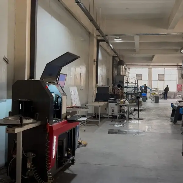
Real photo from our production floor — every sign we ship is made here.
Products mentioned or relevant to this topic — factory-direct, custom built.
From $24/letter · MOQ 1 piece · Flexible lead time · CE & UL certified · ships to 20+ countries
Custom sizes, colors, and finishes. Get a factory price in 24 hours.
Get a Free Quote Copy EmailWhatsApp +86 13865703472 · business@aochuangsign.cn
See pricing, specs, and get a free quote for the sign type you need. Built in our factory, shipped worldwide.