
Most sign guys will hand you a glossy brochure and say “this one’s cleaner.”
They’re not wrong. But they’re leaving out the part where that clean look can bite you on a west-facing wall in Phoenix. I’ve been building channel letters since 1998—long before trimless was a buzzword—and I’ve shipped both standard front-lit channel letters and rimless (trimless) letters worldwide. The difference isn’t about “modern vs. old.” It’s about physics. A standard cap return uses a metal trim—aluminum or stainless—that wraps around the acrylic face, holding it like a picture frame. The trim is part of the letter can, usually 1.0-1.5mm aluminum, and the 3mm acrylic face sits flush inside it. Trimless? That metal lip is gone. The acrylic goes edge-to-edge, and the letter body attaches from behind, typically to a clear polycarbonate backplate. No visible fasteners. No frame. Just light and face.
Here’s what nobody tells you: 80% of the channel letters I’ve shipped in 16 years are standard returns. Not because they’re cheaper—because they survive.
The metal trim isn’t decoration. It’s armor. When some kid throws a baseball at a storefront, the trim takes the hit. When a pressure washer gets too close, the trim deflects the jet before it peels the vinyl or separates the silicone seal. I’ve seen standard letters come out of Florida hurricanes with bent returns but intact faces. You straighten the can, replace the LED module, and they’re back up. With trimless, that same impact shatters the exposed acrylic edge, and you’re cutting a whole new face. Not fun on a Sunday night.
The visual? It’s classic. You get a crisp 1/8" to 1/4" metal rim around the letter. Painted to match the building, it blends. Painted a contrast color, it pops. The face sits slightly recessed, which means even if the acrylic expands in summer heat, the trim hides any minor bowing. This is why 304 stainless steel trim still dominates strip malls from Dallas to Dubai. It’s not flashy. It’s just there, lighting up, year after year.
Look, I’m not saying standard returns are perfect. If you want a seamless, edge-to-edge glow where the letter appears to float with zero hardware, this isn’t it. The trim adds a shadow line that, up close, reminds you it’s a manufactured object. But for longevity and ease of service, I’ll take that shadow line every time.
The ugly truth is that trimless channel letters are gorgeous and fragile in equal measure.
When you stand ten feet away, a well-made rimless letter looks like a block of solid light. No metal edge, no fasteners, no distraction. Architects love them because they align with minimalist façades—glass curtain walls, high-end retail, corporate lobbies. The face goes right to the perimeter, so from an angle, you don’t see a dark metal lip reflecting the parking lot. The whole letter is luminous. That’s the selling point. And it’s a real one, when the job calls for it.
To get that look, we ditch the aluminum trim and rely on a transparent polycarbonate backing plate. The acrylic face—at least 5mm thick, never 3mm—is attached to that backplate with structural adhesive and neutral silicone. The letter can is fabricated separately and mounted behind. This creates a halo effect at night as light leaks through the clear backer, which many clients love. But it also means the only thing between the weather and your LED investment is that exposed acrylic edge and a glue joint.
I’ve seen this go wrong: a coffee chain in Vancouver ordered 40 trimless letters. Two winters of freeze-thaw cycles, water crept into a micro-gap at the top edge, froze, expanded, and opened the joint like a can opener. By spring, three letters had condensation inside. The fix wasn’t a quick module swap; it was a face removal, clean, re-bond, and re-seal. The labor cost them as much as the original letters. They switched to standard returns on the next location.
Let’s put them next to each other at 50 feet, 10 feet, and 2 feet.
At 50 feet: You honestly can’t tell the difference, unless the trim is painted a contrasting color. The eye reads both as a lit letter. The trimless version might seem a hair larger because the light goes all the way to the edge, but on a building façade, it’s subtle. If your client’s budget is tight and the sign is above the second floor, standard returns are the smarter money.
At 10 feet: The standard letter shows a clean metallic border—maybe 3/4" deep, painted flat black or metallic silver. It frames the letter. The trimless letter disappears into the wall. No frame. It looks more like the light is emerging from the building itself. This is where architects and designers start getting excited. They’ll pay 20-30% more for that floating effect.
At 2 feet: You see everything. On a standard letter, you might spot a screw head in the trim, a seam where the trim bends at a corner, or a tiny gap between the face and the return. A good fabricator makes those disappear, but they’re there. On a trimless letter, you see the acrylic edge—usually flame-polished or CNC-polished. If it’s not polished perfectly, it looks milky. You see the 2mm clear backer behind the face. Any dust or debris trapped during assembly is now lit up like a museum exhibit. The visual bar is higher. Much higher. Quality control on trimless demands 100% inspection under white light at our shop, because even a fingerprint inside will glow at night.
Here’s what nobody tells you about trimless acrylic edges: UV doesn’t care about your design intent.
Standard cap returns cover the edge of the acrylic face with metal, so only the front face sees sunlight. That’s manageable—quality UV-resistant acrylic from Mitsubishi or Degussa lasts 5-8 years without yellowing. The edge stays protected. Trimless letters expose the entire perimeter of the acrylic to sun, rain, and pollution. That edge yellows faster. I’ve measured a noticeable color shift on the edges as early as 18 months with domestic acrylic, and 4-5 years with top-shelf material. No one warns you about that at the design presentation. They just show renderings.
If you’re putting trimless letters on a south- or west-facing wall in Arizona or Australia, insist on thick (5mm+) Mitsubishi acrylic and accept that you’ll probably be replacing faces in year 7. With standard returns, those same faces might look new at year 10. That’s not marketing spin. That’s photons breaking polymer chains.
Another visual difference: how the light behaves inside the can.
Standard letters have a metal return that reflects light. Our factory uses white painted interiors as standard, which evens out the illumination and prevents shadows at the trim. With 2835 SMD modules spaced 2-3 inches apart, you get a uniform face that’s hard to fault. The trim contains the light, so there’s minimal bleed.
Trimless letters are a different beast. That clear backer lets light escape out the sides, which produces a soft halo—awesome if you want a dual-lit look without paying for separate halo LEDs. But it also means the face can appear darker near the edges if the LEDs aren’t positioned carefully. I’ve seen budget trimless signs with obvious dark rings where the modules didn’t extend close enough to the perimeter. The fix is either a diffuser film on the backer or a tighter module layout. Both cost money. A properly built rimless letter from our shop uses edge-lighting techniques and reflective backer trays to push light all the way to the acrylic rim. We learned that after a hotel in Dubai sent back photos of “floating donuts.” Lesson learned.
Look, standard letters mount with the trim taking the structural load. You drill through the back of the can, attach to a raceway or directly to the wall with all-thread studs, and the trim acts as a rigid frame. Easy. A two-man crew can hang a full set in a morning.
Trimless letters have no face frame. The mounting plate is a sheet of clear polycarbonate with studs bonded to it. You’re essentially hanging the sign by a plastic panel. If the wall isn’t dead flat, the acrylic face twists. Once twisted, the edge chipped. I’ve seen sign shops shim rimless letters with stacks of washers, and the resulting uneven light reflection looks terrible. To do it right, you need a perfectly level, smooth substrate—think aluminum composite panel backing or a raceway with a flat front face. Our installation instructions for rimless channel letters include a mandatory warning: wall flatness tolerance must be within 1/8" over 10 feet, or you void the warranty on edge cracking. That’s not legalese; that’s a wake-up call.
The ugly truth is that many importers don’t know they’re paying for a headache.
A standard 18-inch front-lit letter in 304 stainless steel with Samsung LEDs costs about $45-65 from our factory. The same letter done trimless with a polycarbonate backer, 5mm UV-stabilized acrylic, and reinforced adhesive system runs $65-100. That’s a 30-50% premium, and we’re not padding the bill—we’re accounting for slower assembly, higher material cost, and the 100% inspection under 5000K light that catches defects you can’t hide with a metal trim. US retail installed pricing follows the same curve: a standard letter might go for $350-500 installed, while rimless versions push $600-900. The “clean look” tax is real.
Here’s where it gets painful. I’ve had customers order rimless letters to save money on a “premium look,” then skimp on the installation. They mount them directly on old brick without a flat surface. Six months in, corners crack, water gets in, LEDs flicker. The warranty doesn’t cover that. A standard letter on that same brick would have survived because the metal trim bridges irregularities. So the true cost comparison isn’t just the letter price; it’s the total installed system with proper backing. If you’re not prepared to add a flat mounting panel, don’t order trimless. I’ve told clients that directly. Some walked. Others thanked me later.
After 15,000+ channel letters, here’s my mental checklist when a customer asks which way to go:
I’ve opened 16 years of channel letters that came back for refurbishment. The ones that aged beautifully were mostly standard cap returns with thick acrylic faces and quality silicone. The trimless beauties that still looked perfect? They had one thing in common: they were installed on flat, protected surfaces by guys who read the damn manual. The ones that failed? Exposed edges, uneven walls, and customers who chose “clean” over “durable” without understanding the trade-off.
Both types have a place. I ship both. I’ll happily build you a set of standard front-lit channel letters that’ll outlast the lease, or a batch of rimless letters that’ll make the architect smile—as long as you know where the weak points are. Because at 2 a.m. when a letter goes dark, it’s not the brochure you’ll be cursing. It’s the physics you ignored. Choose the right tool for the job. That’s the whole game.
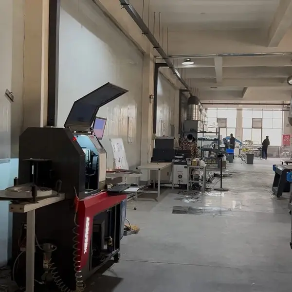
Real photo from our production floor — every sign we ship is made here.
Products mentioned or relevant to this topic — factory-direct, custom built.
Factory-direct since 2010. Free quote within 24 hours — no obligation.
Get a Free Quote → Copy EmailMOQ: 1 piece · Flexible lead time · 2-year warranty · Worldwide shipping
See pricing, specs, and get a free quote for the sign type you need. Built in our factory, shipped worldwide.