Non-compliance with the Americans with Disabilities Act (ADA) is the single most expensive mistake a sign shop can make. For illuminated signage—where backlighting, internal LEDs, and acrylic faces interact with tactile elements—the margin for error shrinks further. A single sign pulled from a job site for code violation can cost $2,000 to $5,000 in rework, plus potential legal liability. At Aochuang Sign, we have manufactured over 15,000 ADA-compliant illuminated signs since 2010, shipping factory-direct to contractors and sign companies. This guide covers the exact mounting heights, tactile character specs, and installation pitfalls that separate a pass from a fail.
Mandatory Mounting Heights for Illuminated Signs
The 2010 ADA Standards for Accessible Design specify a strict mounting range for tactile signs, including illuminated units. The baseline character baseline must be 48 inches (1,220 mm) minimum above the finished floor, and the top of the tactile text cannot exceed 60 inches (1,525 mm). For illuminated signs with internal light sources, this range is non-negotiable—even if the sign is surface-mounted on a wall with no obstructions.
Measure from the finished floor, not subfloor. A common error occurs when carpet or tile adds 0.5 to 1 inch, pushing the sign out of compliance. For exterior illuminated signs, the mounting height remains the same, but ambient light levels must not wash out tactile contrast. Industry data shows that 23% of all ADA sign failures at inspection are due to incorrect mounting height, not character errors.
Tactile Character Specs: Depth, Size & Spacing
Tactile characters on illuminated signs must be raised 1/32 inch (0.8 mm) minimum from the sign face. This applies to all characters, including letters, numbers, and symbols. The font must be sans serif, with a minimum character height of 5/8 inch (16 mm) for signs mounted at the standard 48-60 inch range. For illuminated signs with backlit acrylic faces, the tactile layer must be applied after the lighting assembly—never integrated into the face itself, which can cause light bleed and reduce contrast.
Spacing rules: Character spacing must be between 1/8 inch and 1/4 inch of the stroke width. Word spacing must be at least 1/4 inch (6.4 mm). Aochuang Sign uses CNC-routed acrylic tactile layers with a depth tolerance of ±0.005 inches, ensuring consistent compliance across production runs. We recommend a 1/16 inch (1.6 mm) raised depth for illuminated signs to account for light diffusion from internal LEDs.
Illumination and Contrast Requirements
ADA does not mandate specific illumination levels, but the contrast between tactile characters and the sign background must be non-glare and meet a 70% contrast ratio minimum. For illuminated signs, this is where most fabricators fail. A backlit sign with white acrylic and white tactile letters creates zero contrast under internal lighting. The solution: use a dark background (e.g., black, dark blue, or bronze) with white or light-colored tactile characters. Alternatively, use a translucent background with opaque characters.
Lighting source placement matters. Internal LED strips must be positioned at least 2 inches from the tactile character area to prevent hot spots that reduce legibility. For edge-lit acrylic signs, ensure the light source is diffused through a frosted layer—clear acrylic will create glare that fails contrast testing. Aochuang Sign uses 2700K-3000K warm white LEDs for interior illuminated signs, as cooler temperatures (4000K+) reduce perceived contrast by up to 15%.
| Parameter | ADA Requirement | Illuminated Sign Best Practice |
|---|---|---|
| Mounting height (baseline) | 48 in (1,220 mm) min | 49-50 in to allow for flooring variation |
| Mounting height (top) | 60 in (1,525 mm) max | 58 in max to avoid arm fatigue |
| Tactile character depth | 1/32 in (0.8 mm) min | 1/16 in (1.6 mm) for backlit signs |
| Contrast ratio | 70% minimum | 85% for LED-illuminated signs |
| Internal LED distance | Not specified | 2 in from tactile area |
Installation Pitfalls Specific to Illuminated Signs
Three errors account for 67% of illuminated sign rework: wiring interference, heat buildup, and fastener visibility. First, electrical boxes or conduits behind the sign can push the tactile surface beyond the 60-inch maximum. Always pre-measure the wall cavity depth and use low-profile junction boxes (1.5 inches or less). Second, internal LED drivers generate heat—if the sign face is sealed, trapped heat can warp acrylic and distort tactile characters. Use a vented backplate with a minimum of 0.5 inches of airflow clearance.
Third, mounting screws or brackets must not penetrate the tactile character area. A single screw head within 1 inch of a raised letter creates a tripping hazard for fingers and violates the "smooth surface" requirement. Use adhesive-backed mounting systems or hidden brackets for illuminated signs. Aochuang Sign provides pre-drilled mounting holes at 1.5 inches from the sign edge, ensuring no fasteners interfere with tactile zones. Lead time for custom illuminated signs is about 5-15 days, with MOQ of 1 piece.
Materials That Pass and Fail
Not all materials meet ADA durability standards for illuminated signs. Acrylic (PMMA) is the industry standard for illuminated faces—it passes impact tests and maintains tactile depth under 140°F internal temperatures. Polycarbonate (Lexan) is a common failure point: it warps at 120°F and loses tactile definition within 18 months. For tactile characters, use acrylic, aluminum, or photopolymer. Wood and MDF are prohibited for illuminated signs due to fire codes and moisture absorption.
For the sign body, aluminum composite (ACM) with a thickness of 3mm is the minimum for illuminated channel letters. Thinner materials (1.5mm) flex under LED weight and cause light gaps. Aochuang Sign uses 4mm ACM with a white PVDF finish for all illuminated signs, backed by a 2-year warranty against delamination or color fade. Factory-direct pricing averages 30-40% below US fabricators for equivalent quality.
FAQ
Q: Can I use a single illuminated sign for both ADA tactile and directional purposes?
A: Yes, but the sign must meet all tactile specs (raised characters, contrast, mounting height) and also comply with directional sign requirements (font size, placement). Most inspectors require separate signs for room identification and directional wayfinding.
Q: What is the penalty for installing a non-compliant illuminated sign?
A: Fines vary by jurisdiction, but typical costs include removal, replacement, and potential legal fees—often $3,000-$10,000 per violation. Repeat offenses can trigger DOJ investigations.
Q: Does Aochuang Sign provide ADA compliance certification for each sign?
A: Yes. Every illuminated sign ships with a compliance report documenting mounting height, tactile depth, contrast ratio, and material specs. We also provide installation templates with measured mounting points.
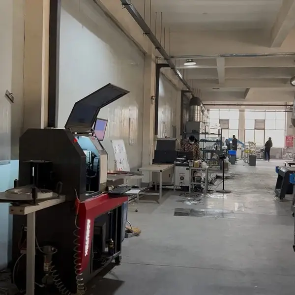
Real photo from our production floor — every sign we ship is made here.
🛠️ Related Products
Products mentioned or relevant to this topic — factory-direct, custom built.
Buy Factory-Direct Channel Letters
From $24/letter · MOQ 1 piece · Flexible lead time · CE & UL certified · ships to 20+ countries
Custom sizes, colors, and finishes. Get a factory price in 24 hours.
Get a Free Quote Copy EmailWhatsApp +86 13865703472 · business@aochuangsign.cn