FAA-Compliant Materials for Airport Signage
Airports are busy, and people rely on signs to find their way. FAA compliance is about safety as much as appearance. The FAA has specific material requirements. Acrylic letters need a 90-92% light transmittance rate. They are UV-resistant, so they stay clear instead of yellowing after years of sun. If a sign is over 2.5 meters, use 5mm thick acrylic to keep it durable.
Stainless steel letters are a good choice for outdoor use. Grade 304 stainless steel has a 10+ year outdoor life. If the sign is near the coast, move up to 316 stainless for better corrosion resistance. Brushed or powder coated finishes both hold up well.
What High-Quality Airport Signage Costs
High-quality airport signage costs real money, but it holds up.
Channel letters for front-lit setups run about $20-80 per letter. Neon signs run $30-200 per sign. LED channel letters are the better long-term choice. Factory front-lit letters run $20-80 per letter, and installed in the US they usually run $200-700 per letter. Express shipping takes about 5-15 days and costs about $30-100 for small packages. Local permit costs and installation labor vary by project, so plan for that. UL 48 certification runs $4,000-15,000.
LED vs. Neon: Which Lasts Longer in Airport Lighting
LEDs hold up better than neon in airport lighting.
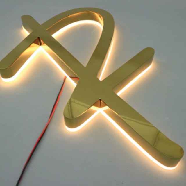
Neon signs have a certain look, but they need a lot of maintenance. They last about 15,000 hours. LEDs using SMD 2835 modules at 100-150 lm/W are a better choice. They have an L70 lifespan of 50,000 hours, which means they keep their brightness for 5+ years. Samsung and Osram modules are reliable. Neon signs can also be a fire risk. LEDs are safer, use less power, and do not need the same level of care.
FAA Signage Dimensions for Accurate Installation
The FAA has strict sign dimensions, and they matter for more than appearance. Tactile signs need to be 48 to 60 inches high to meet ADA standards. If the height is off, the sign is harder for people with disabilities to use. Braille also has to be Grade 2. I have seen too many people assume any Braille will pass. It will not. Get the dimensions and the Braille right the first time, or you will be redoing the sign.
Material thickness matters too. For outdoor signs, acrylic needs to be thick enough to be UV-resistant. Mitsubishi or Degussa acrylic lasts 5-8 years outdoors. Domestic acrylic can start yellowing in 1-2 years. Stainless steel is different. 304 stainless has an outdoor life of 10+ years, but it is heavier and costs more. 316 stainless lasts 15+ years in marine environments and costs a bit more than 304. It is a trade-off between durability and cost.
Do not overlook the LED modules. SMD 5730 chips are bright, at 40-60 lm/chip. Module quality matters. Samsung, Osram, and Blueview modules usually last 5+ years. Cheap modules often fail in 12-18 months. If dimensions and materials are correct, the sign will last.
Stainless Steel vs. Aluminum for Airport Signs
Stainless steel is used a lot in outdoor signage because it lasts 10+ years and is strong. It is also heavy, about 7.93g/cm³, which makes installation harder. Aluminum is about one-third the weight of steel and is naturally rust-resistant. It is not as strong as stainless, but it is easier to work with. In coastal or industrial areas, stainless steel is the better choice. For most other locations, aluminum is easier and cheaper to handle.
Finish options also matter. Aluminum can be anodized, powder coated, or brushed. Stainless steel can be brushed #4, mirror #8, PVD, or powder coated. For airport signs, you want a material that lasts and is easy to maintain. Aluminum does not rust and is easy to clean. Stainless steel is good, but it is not always necessary.
The cost difference is real. Stainless steel costs more and weighs more, so labor goes up. Aluminum is cheaper and easier to install. For most airport sign projects, aluminum makes more sense. Stainless steel still has its place, especially in harsh environments.
Certifications for Airport Signage
UL 48 runs $4,000 to $15,000. It takes 4 to 9 months, with quarterly audits. ETL is an alternative to UL and costs about 10 to 30% less. CE costs a few thousand dollars and takes 2 to 8 weeks. For outdoor signage, IP65 is the minimum. Coastal areas often need IP66 or better. In the US, electrical signs also need to meet NEC Article 600. Certification is not a formality; it is a real commitment to safety and quality.
Frequently Asked Questions
What are the most common materials used for airport signage?
The most common materials are stainless steel, aluminum, and acrylic. Stainless steel has a 10+ year outdoor life and is very durable. Aluminum is lighter and lasts 8-12 years, which makes it a more cost-effective choice. Acrylic has high light transmittance and works indoors or outdoors.
How long does it take to get an airport sign certified?
Certification times vary, but UL 48 takes 4 to 9 months. CE certification takes about 2 to 8 weeks. ETL certification is generally quicker than UL 48 but can still take several months.
What is the standard lead time for custom airport signage?
Lead time for custom airport signage is usually about 5-15 days. That includes design confirmation, production, and quality control. It can be longer depending on the project and material availability.
Are there any special considerations for LED signs in airports?
Yes, LED signs have to meet brightness and lifespan requirements. SMD 5730 chips are a common high-brightness option, with an L70 lifespan of at least 50,000 hours. Samsung, Osram, and Blueview modules usually last 5+ years.