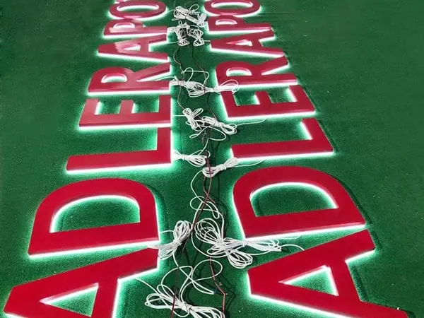
You've got a brand logo that needs to get up on a storefront. Maybe it's a chain with locations in three states. Maybe it's a one-off for a dentist who wants something that screams "I'm not your father's dentist." Either way, you're staring at a vector file and wondering how to turn it into channel letters that don't look like junk six months from now.
I've installed commercial signs for twenty years across thirty-plus states. I've watched guys spend $800 on a single front-lit letter from a domestic shop, same 304 stainless and Samsung LEDs we ship from Asia for $120. I've also watched guys buy cheap modules and wonder why half the letters went dark before the contractor walked away. This article isn't theory. The manual doesn't cover what I'm about to tell you—the stuff you learn when you're up on a ladder at 7 AM with rain forecast and a landlord screaming about the inspection.
Don't make the mistake I made: taking a raster logo from a client's website and trying to convert it to a channel letter path. I did that once. Ended up with a "G" that looked like a deformed potato because the curvature didn't convert cleanly. Now I demand a vector file—AI, EPS, or SVG—with the fonts outlined and no stray points. That's non-negotiable.
Pro tip: If the brand has a style guide, get it.
You need the exact color codes (Pantone, CMYK, and RGB), the minimum letter size, and the spacing rules. Channel letters are 3D—you can't just scale up a 2D logo. Thick letters under 4 inches tall? The LED channel space gets too tight, and you end up with hot spots or shadows. For a front-lit letter, the face needs to be at least 1.5 inches deep to fit a good LED module.
Halo-lit backs need even more: 2 to 3 inches minimum so the light spreads evenly behind the letter. Ignore that, and you'll get a halo that looks more like a headache.
Another thing: the file needs to show returns and flanges. The digital file you send to fabrication has to include a 12–15mm return (the metal sidewall that gives the letter depth). Most vector files don't show that—they're flat. You have to specify it, or the factory will guess. And guesswork is where mistakes happen.
Here's what the permit office won't tell you: some towns require the channel letter to match the approved sign permit exactly. If your drawing doesn't show the return depth, the inspector can reject it. I had a job in Jersey where the inspector pulled out a ruler and measured the return on site. The letter was supposed to be 2 inches deep; the shop made it 1.75. Had to redo two letters. Cost me time and face.
You don't need to know everything about 304 vs. 316 stainless, but you do need to know when to push for the upgrade. For a coastal job—Miami Beach, Galveston, anyplace within a mile of saltwater—316 stainless is the only call. It costs 20–30% more than 304, but 304 will start pitting in three years. I've seen it. The remaining project-specific details depend on the approved design, installation conditions and local code; confirm them before ordering.
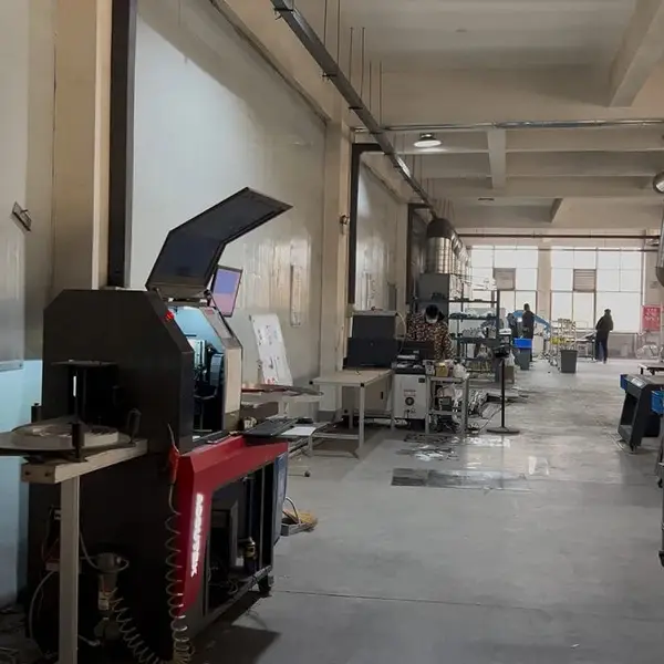
Real photo from our production floor — every sign we ship is made here.
Products mentioned or relevant to this topic — factory-direct, custom built.
From $24/letter · MOQ 1 piece · Flexible lead time · Project-specific compliance documents · ships to 20+ countries
Custom sizes, colors, and finishes. Get a factory price in 24 hours.
Get a Free Quote Copy EmailWhatsApp +86 13865703472 · business@aochuangsign.cn
See pricing, specs, and get a free quote for the sign type you need. Built in our factory, shipped worldwide.