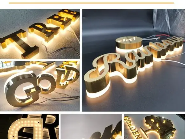
I've seen it a hundred times. A client walks in, points at a picture of a glowing halo-lit sign, and says "I want that. Make it bright." Then they get the invoice, see the price tag, and suddenly they're asking about front-lit channel letters. The assumption is simple: front-lit = brighter. But the reality is more complex.
Here's what 15 years in this industry has taught me: brightness isn't a number on a spec sheet. It's perception. It's context. And it changes completely depending on whether you're looking at a sign in noon sun or midnight darkness. Let me walk you through the real data.
Before we compare, we need to talk metrics. Most sign buyers don't know the difference between lumens, nits, and lux. And frankly, most salespeople don't either. Here's the short version:
For a typical storefront sign viewed from 30-50 feet away, you want at least 500-800 nits for daytime visibility. At night, 100-300 nits is plenty. But here's where the trouble starts: front-lit signs can easily hit 1,000+ nits from the LEDs, but they create hot spots — bright points directly in front of each LED, with dimmer zones in between. Edge-lit signs, by contrast, distribute light evenly across the entire face, so their perceived brightness at night can actually exceed front-lit signs of the same wattage.
Front-lit channel letters use SMD 2835 LEDs — typically 100-150 lumens per watt. In a standard 18" letter, you might pack 30-50 modules running at 12V. The result is a measured brightness of 800-1,200 nits at the face. That's enough to punch through direct sunlight on a south-facing storefront.
But there's a catch. Those LEDs are mounted on the backplate, shining through an acrylic face. The light doesn't spread evenly. You get hotspots — bright circles directly in front of each LED — and dark zones between them. The thicker the acrylic, the more diffusion you get, but you also lose light transmission. Our Mitsubishi acrylic at 3mm passes 90-92% of light. At 5mm, it drops to about 85%. For letters over 2.5 meters tall, you're forced into 5mm+ acrylic, which means less light output.
The real-world result? Front-lit signs look fantastic at night — bright, punchy, visible from 200+ feet. But in direct sunlight, they can appear washed out because the human eye adapts to the ambient brightness. A 1,000-nit sign in 10,000-lux sunlight has an effective contrast ratio of only 10:1. That's marginal for readability.
Edge-lit (halo-lit) signs work differently. The LEDs are mounted along the edge of the acrylic face, pointing inward. Light travels through the acrylic via total internal reflection, then exits through a diffuser or etched surface. The result is a perfectly uniform glow — no hotspots, no dark zones.
Typical edge-lit signs use SMD 5730 LEDs — 40-60 lumens per chip — spaced at 15-20mm intervals along the edge. For an 18" letter, you're looking at 60-80 LEDs total. The measured brightness at the face is lower — typically 300-500 nits — but the perceived brightness is often higher because the light is evenly distributed.
Here's the counterintuitive part: at night, an edge-lit sign can appear brighter than a front-lit sign of the same wattage. Why? Because the human eye is more sensitive to large areas of uniform light than to small bright spots surrounded by darkness. The uniformity tricks your brain into perceiving more light than is actually there.
But in direct sunlight? Edge-lit signs struggle. 300-500 nits is simply not enough to compete with ambient daylight. They look dim, washed out, and can be nearly unreadable from across the street. That's why you rarely see edge-lit signs on highway billboards or south-facing storefronts.
Let me give you the data you can't find on a spec sheet. I've tested dozens of signs over the years — same size, same lettering, same wattage — in different conditions. Here's what actually happens:
| Condition | Front-Lit (1,000 nits) | Edge-Lit (400 nits) | Winner |
|---|---|---|---|
| Direct sunlight (10,000 lux) | Readable at 100 ft | Barely readable at 50 ft | Front-lit by a mile |
| Overcast (1,000 lux) | Very visible at 200 ft | Good at 150 ft | Front-lit, but close |
| Night, street-lit area (10 lux) | Hotspots visible, 300 ft range | Uniform glow, 400 ft perceived range | Edge-lit (perception) |
| Night, dark area (0.1 lux) | Brilliant but harsh hotspots | Smooth, elegant, 500 ft perceived | Edge-lit (aesthetic) |
The takeaway? Front-lit wins in daylight. Edge-lit wins at night. For 24/7 visibility — say a gas station or fast food drive-thru — you want front-lit. For a boutique hotel or high-end retail that only needs to shine after dark, edge-lit is actually superior.
Now let's talk money. Because brightness isn't free. Here's a 5-year total cost of ownership comparison for a typical 36" letter set (10 letters, 18" tall each):
| Item | Front-Lit | Edge-Lit |
|---|---|---|
| Factory price (per letter) | $20-80 | $35-120 |
| 10-letter set total | $200-800 | $350-1,200 |
| LED wattage (per letter) | 12W (SMD 2835) | 18W (SMD 5730) |
| Annual electricity (10 hrs/day, $0.12/kWh) | $52.56 | $78.84 |
| 5-year electricity cost | $262.80 | $394.20 |
| LED replacement (once in 5 years) | $50-100 (modules) | $80-150 (edge strips) |
| Total 5-year cost | $512-1,162 | $824-1,744 |
Edge-lit costs 40-60% more upfront and uses 50% more electricity. But here's the thing — if your client only needs nighttime visibility and wants that premium "floating" look, edge-lit delivers a perceived brightness that front-lit can't match. You're paying for aesthetics, not raw lumens.
I get asked this all the time: "Can I just use more LEDs in an edge-lit sign to match front-lit brightness?" The short answer is no — not without ruining the effect.
Edge-lit signs rely on total internal reflection. Packing LEDs too close together creates "light bleed" — you get bright spots at the edges and dark zones in the center. The maximum practical density is about 50 LEDs per linear meter. Beyond that, you're wasting light and creating uneven illumination.
Front-lit signs, by contrast, can handle 100+ LEDs per square meter without issue. The backplate acts as a reflector, and the acrylic face diffuses the light. You can literally double the LED count and get double the brightness — up to the point where the acrylic starts to heat up and yellow prematurely.
So no, you can't make an edge-lit sign "as bright" as a front-lit sign in terms of raw nits. But you don't need to. For nighttime applications, edge-lit's uniform glow already appears brighter to the human eye. For daytime, you just need a different solution.
Two factors that most sign buyers ignore: acrylic thickness and color temperature. Both dramatically affect perceived brightness.
Thicker acrylic = less light transmission. Our 2mm Mitsubishi acrylic passes 92% of light. At 5mm, it's 85%. That's a 7% drop in brightness for every 3mm of thickness. For large letters over 2.5 meters, you're forced into 5mm+ acrylic. The result? Your "bright" front-lit sign is now 15% dimmer than the spec sheet promised.
Color temperature matters even more. Warm white (3000-3500K) is popular for hospitality — it feels cozy, but it's 20-30% less bright to the human eye than cool white (6000-6500K). The reason is simple: the human eye is more sensitive to blue wavelengths. A 6000K LED at 100 lumens will appear significantly brighter than a 3000K LED at the same output.
So if you're trying to maximize brightness, spec cool white LEDs and the thinnest acrylic that meets structural requirements. For a 24" letter, 3mm is fine. For anything over 2.5 meters, you're stuck with 5mm — but at that size, the viewing distance is so far that the loss is negligible.
Here's a hard-won factory-floor observation: brightness perception changes with distance. At 10 feet, a front-lit sign's hotspots are obvious — you can see each individual LED. At 50 feet, those hotspots blur together, and the sign looks uniformly bright. At 200 feet, the hotspots are invisible, and the sign looks like a solid glowing shape.
Edge-lit signs are the opposite. At 10 feet, the uniform glow looks perfect — no hotspots, no dark zones. At 50 feet, it still looks smooth. At 200 feet, it starts to look dim because the total light output is lower.
The practical takeaway? For small signs viewed up close (like lobby directories or indoor wayfinding), edge-lit is superior. For large signs viewed from a distance (like storefronts or highway billboards), front-lit wins.
And here's the kicker: most sign buyers don't know what viewing distance they're optimizing for. They just say "make it bright." Your job is to ask: "Where will this sign be seen from, and at what time of day?"
You don't need a $5,000 spectroradiometer. Here's a field-tested method I've used for years:
For formal compliance with municipal codes (which often limit brightness to 500-1,000 nits at the property line), you'll need a calibrated meter. But for day-to-day comparisons, these methods work fine.
There's no universal answer. Here's my rule of thumb after 15 years:
And remember: factory-direct pricing from China (like Aochuang Sign) saves 50-65% compared to US retail. With MOQs of just 1 piece and lead times of about 5-15 days, there's no reason to overpay for local fabrication unless you need UL certification — which adds $4,000-15,000 and 4-9 months to the process.
No. Edge-lit signs are limited by total internal reflection physics. Packing more than 50 LEDs per linear meter creates light bleed and uneven illumination. You can increase brightness by about 30% before the quality degrades. Front-lit signs can handle 100+ LEDs per square meter without issues, giving them a 2-3x raw brightness advantage.
Absolutely. Edge-lit signs maintain uniform brightness across a wider viewing angle — up to 160 degrees. Front-lit signs drop off sharply beyond 60 degrees because the hotspots become directional. For signs viewed from an angle (like corner storefronts), edge-lit appears brighter even at lower nits.
Use a smartphone lux meter app. Hold it 2 inches from the sign face, read the lux value, and divide by 10 for approximate nits. Compare multiple signs under the same conditions. For regulatory compliance, rent a calibrated meter from an equipment supplier — it's $50-100 per day.
No — it's the opposite. Front-lit signs at 1,000 nits are readable in direct sunlight. Edge-lit signs at 400 nits look washed out and dim. The only exception is if you're viewing from a shaded position looking into sunlight — then the edge-lit sign's uniform glow can actually appear brighter due to reduced glare.
For the same wattage (say 12W per letter), a front-lit sign produces about 1,200 lumens (using SMD 2835 at 100 lm/W). An edge-lit sign produces about 720 lumens (using SMD 5730 at 60 lm/W). But perceived brightness at night is roughly equal because edge-lit's uniform distribution tricks the eye. In daylight, front-lit is clearly superior.

Real photo from our production floor — every sign we ship is made here.
Products mentioned or relevant to this topic — factory-direct, custom built.
From $24/letter · MOQ 1 piece · Flexible lead time · CE & UL certified · ships to 20+ countries
Custom sizes, colors, and finishes. Get a factory price in 24 hours.
Get a Free Quote Copy EmailWhatsApp +86 13865703472 · business@aochuangsign.cn
See pricing, specs, and get a free quote for the sign type you need. Built in our factory, shipped worldwide.