Let's Start With the Lie You're Being Sold
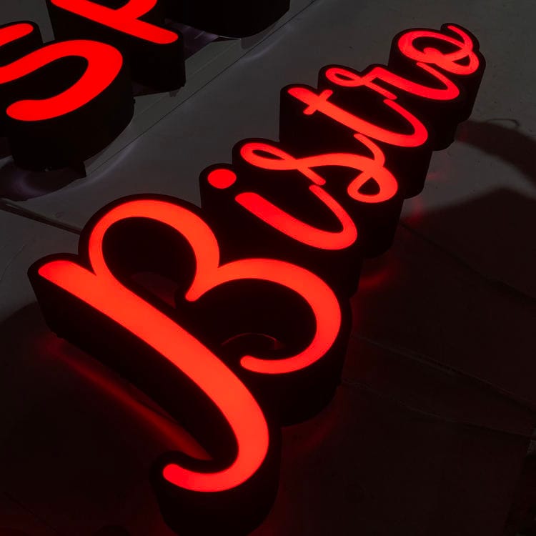
Let me break this down: most museum signage projects I see start with an architect's rendering that looks beautiful and a budget that's already blown. The client wants "museum-quality" but nobody defines what that means. So the local sign shop quotes you $800 per letter for front-lit stainless steel. I've watched sign shops pay $800 for a front-lit letter from a domestic fabricator. Same 304 stainless, same Samsung LEDs. We ship that letter for $120. The difference isn't quality — it's markup and ignorance of how real fabrication works.
Here's the math: a 3mm acrylic face from Mitsubishi has 90-92% light transmittance and UV resistance for 5-8 years. Domestic acrylic yellows in 1-2 years. Your museum sign will be up for a decade. You do the math on which one you want.
Most buyers don't realize that the "museum" in museum signage isn't about the name — it's about the constraints. You've got curated lighting, historical preservation requirements, and ADA rules that are stricter than any strip mall. I've seen a $50,000 wayfinding system fail because the contrast ratio was wrong for a 70-year-old donor with cataracts. That's not a design problem. That's a physics problem.
The Real Specs That Matter for Wayfinding
The spec says "ADA compliant" — but in reality, it's not just about mounting height between 48 and 60 inches and using Grade 2 Braille. The real fight is with glare. NEC Article 600 has rules for sign illumination, but it doesn't tell you that a polished stainless steel #8 mirror finish will blind someone under track lighting. We spec brushed #4 finish or powder-coated matte for any museum installation. The difference in reflectivity is 60-80% less. You don't need a mirror — you need readability.
Here's the brutal truth: most wayfinding systems in museums fail not because of bad design, but because of bad contrast. A white letter on a matte black acrylic panel might look clean on a screen, but in a hallway with mixed daylight and LED spots, the effective contrast drops by 30-40%. We always run a luminance contrast test using a calibrated light meter before signing off. The standard says 70% contrast minimum. We aim for 85%.
Another number you need: viewing distance. For a museum gallery, the average person reads a sign from 4-6 feet away. That means letter height should be at least 2-3 inches for main labels. For directional signs at the end of a 40-foot corridor, you need 6-inch letters. LED modules running at 100-150 lm/W (SMD 2835) can punch through that distance cleanly. If you spec cheaper LEDs, you'll get 40-60 lm/W and need to double the letter size to compensate. That changes your architectural layout.
Lighting: The Part Everyone Gets Wrong
Let me break this down: your museum has controlled lighting — dimmers, color temperature tuning, maybe even UV filters on the gallery lights. But your sign's internal lighting? That's a separate animal. We use SMD 2835 LEDs from Samsung or Osram because they hit 100-150 lm/W and have an L70 lifespan of 50,000 hours. That's 5+ years of real use. Cheap modules with dull gray solder joints? They'll die in 12-18 months. Quickest way to spot bad LED modules: look at the solder joints. Dull gray = won't last 18 months. Shiny silver = proper lead-free solder.
Color temperature matters more than you think. Museum curators want warm light for art — 3000-3500K. But wayfinding signs need to read clearly. We compromise at 4000K neutral for directional signs, 3500K for exhibit labels. It's a fight every time, but I've got the data: 4000K gives 10-15% better contrast perception at low light levels compared to 3000K. Your curator's aesthetic preference doesn't beat physics.
Here's another lie: "IP65 waterproof." IP65 means dust-tight and protected against water jets from any direction. It does NOT mean your sign survives a Florida hurricane. For a museum, unless the sign is outdoors in a sculpture garden, IP65 is overkill. Indoor signs need IP54 at most. Save the $4 per module. But if you have a sign near a humidity-prone area like a greenhouse or atrium, go IP66. Coastal museum? Pay for IP68 and use 316 stainless steel. 316 has 2-3% molybdenum, gives 15+ years marine-grade life. 304 will pit in 3 years near salt air.
Material Selection: Acrylic, Stainless, and the Budget Trap
Most buyers don't realize that the acrylic thickness for a museum sign depends on the span, not the size. A 2mm face is fine for letters under 12 inches. But for a 3-foot wide gallery wall panel, you need 5mm acrylic or it will bow. We've seen it happen: a "$200 per square meter"
lightbox with 3mm acrylic and cheap LEDs — within 18 months the face sags, light pools unevenly, and the client blames the fabricator. But the spec was wrong from the start.
For stainless steel, we use 304 grade (18% chromium, 8% nickel) for 95% of museum jobs. Density is 7.93 g/cm³, which means a 3mm thick letter is heavy. That matters when you're mounting on drywall — we always spec backing plates and toggle bolts. Surface finish matters too: brushed #4 for general use, mirror #8 only for decorative accents. PVD coating can give you a black or bronze look without sacrificing the steel's corrosion resistance. A 1.0mm stainless letter is too thin — it'll dent. Go 1.5mm minimum for any outdoor or high-traffic museum entrance.
Let me tell you a story: a museum in Ohio wanted "elegant brushed steel" letters. The architect specified 316 because "it's the best." I asked where the building was — 200 miles from the coast. 304 would have lasted 10+ years indoors. 316 costs 20-30% more. They paid an extra $4,000 for nothing. 316 is for Miami Beach, not Columbus.
Fabrication Tolerances and the 7-15 Day Reality
The spec says "exact match to blueprint" — but in reality, laser cutting gives you ±0.1mm tolerance. That's tighter than most architectural metalwork, but it still means you can't just drop a sign onto a wall. We account for thermal expansion in acrylic — 0.05mm per meter per °C. A 2-meter long sign in a sunlit gallery could expand by 1mm. If you hard-mount it, the face cracks. We use slotted mounting holes and silicone gaskets.
Here's the production timeline: design confirmation (1 day), laser cutting (1-2 days), bending/welding with TIG (1-2 days), grinding/polishing (1-2 days), CNC acrylic face (1 day), LED assembly (1-2 days), sealing with neutral silicone (1 day), 8-12 hour aging test, 100% QC inspection, export packaging (foam + carton + plywood crate). Total: about 5-15 days. Any shop that promises faster is cutting corners — probably skipping the aging test. Aging test catches failures before installation. Skip it and you find out when the sign is up.
Another brutal truth: LCL sea freight means your crate gets handled 6-8 times between our dock and yours. Every touch is a chance for damage. That's not in the brochure. If your museum has a hard deadline, ship air freight. It's $4-12/kg, but your sign arrives in about 10 days without forklift dents. We've seen $5,000 signs destroyed because the freight company stacked 2 tons on top of the crate. Plywood crates are designed for stacking — but only if the handler follows instructions. They rarely do.
Cost Breakdown: What You Should Actually Pay
Let me break this down: factory-direct pricing for museum-grade
channel letters is $20-80 for front-lit, $35-120 for back-lit halo, $15-40 for stainless steel non-lit, $40-120 for 3D fabricated, $10-25 for aluminum. For a 20-letter museum name, that's $400-2,400 from the factory. US retail installed? $200-700 per letter. You're paying 5x for the same product.
Certifications: CE costs 20,000-50,000 RMB and takes 2-8 weeks. Most factories will say they have it. Ask to see the certificate with today's date. Watch them sweat. UL 48 costs $4,000-15,000 and requires quarterly audits. For a museum, UL is overkill unless you're in New York City. ETL is a cheaper alternative — 10-30% less and accepted by most inspectors. If your sign is for a federal building, you need UL. If it's a local history museum, ETL is fine.
Shipping: Sea freight about 65 days for full container ($1,200-3,000 FCL) or $80-200 per cubic meter for LCL. Then add US Section 301 tariff of ~30%. That's a real cost. Don't forget. We always quote with tariff included.
Frequently Annoyed Questions
— *"Can you match the exact Pantone color?"*
Sure. If you provide the RAL or Pantone reference, we'll powder coat or paint to match. But understand that different materials absorb color differently. Anodized aluminum will never match a polyester powder coat — the finish sheen is different. We match to within ΔE ≤ 2 under D65 light. That's as close as any human eye can see. If you want perfection, use the same material for all elements.
— *"What's the warranty?"*
Two years on the LEDs (if they're Samsung or Osram), one year on the power supply. That's standard. The acrylic face has no warranty because it's plastic and scratches. And if you clean it with Windex instead of mild soap and water, the coating fails. That's not our problem.
— *"Can you make it exactly like the rendering?"*
Rendering is a simulation. I can make it within ±1mm overall dimension. But that 3D render shows no seams, no mounting brackets, no wiring access panels. Real signs have those. If you need a seamless look, we'll build a hidden frame. That costs extra. You want invisible — you pay for invisible.
— *"Why can't you ship in 3 days?"*
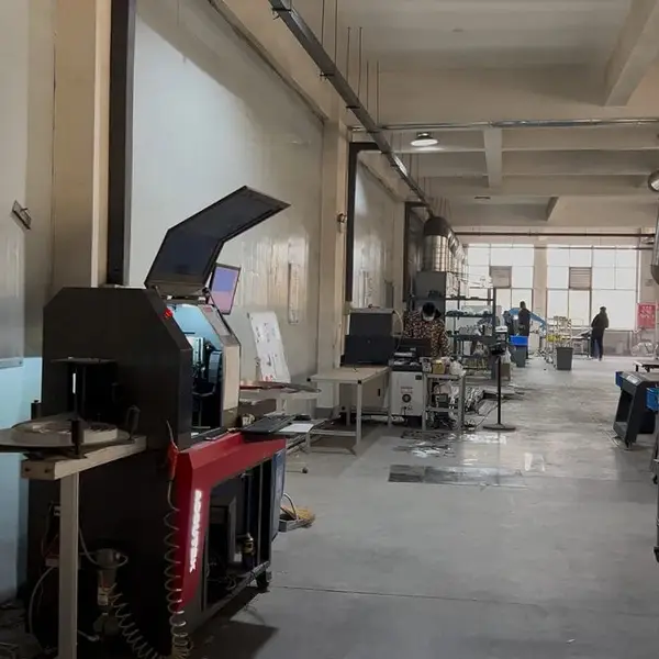
Because I've got 50 workers running 3000 m² of shop floor. We're not Amazon. A 10-step process takes about 5-15 days minimum. If you want speed, I can rush it in 5 days — but I'm dropping the aging test and using a single coat of paint. You'll see bubbles in 6 months. I don't sign off on that. Your call.