Published July 22, 2026
This article is part of our in-depth guide series:
Storefront Signage Design Guide â
You've been there. A client walks in with a logo in a thin, elegant serif font. They want it backlit in 12-inch letters. You knowâdeep down in your gutâthat thing will be unreadable past 50 feet. But they're the customer. So you build it. And then the calls start. "Nobody can read my sign from the road."
Here's the thing: there is actual science behind font legibility on illuminated signs. Not guesswork. Not "what looks good on a computer screen." Real, peer-reviewed data from the Federal Highway Administration (FHWA), ANSI standards, and dozens of field studies. I've been in this business 15 years, and I've watched shops burn thousands of dollars on rework because they didn't know these numbers.
Let's fix that. Right now.
The most common question I get: "What size font do I need for a sign that's 100 feet from the road?" The answer isn't a guess. It's math.
The standard legibility formula used in traffic signage (and applicable to commercial illuminated signs) is 1 inch of letter height for every 30 feet of viewing distance. This is based on the Snellen visual acuity standard (20/20 vision) with a safety margin for real-world conditions. But that's for high-contrast, non-illuminated signs. Illuminated signs get a slight advantageâabout 10-15% better legibility at the same sizeâbut only if the illumination is uniform and the font is optimized.
Here's the real-world breakdown for illuminated channel letters:
| Viewing Distance | Minimum Letter Height (Standard) | Minimum Letter Height (Illuminated, Optimized) | Recommended Stroke Width (as % of height) |
|---|---|---|---|
| 50 feet | 2 inches | 1.75 inches | 18-22% |
| 100 feet | 4 inches | 3.5 inches | 18-22% |
| 150 feet | 6 inches | 5 inches | 16-20% |
| 200 feet | 8 inches | 7 inches | 16-20% |
| 300 feet | 12 inches | 10 inches | 14-18% |
Notice the stroke width changes. At closer distances, thicker strokes (18-22% of letter height) improve readability. But at 300 feet, you actually want slightly thinner strokes (14-18%) because the light bleed from LED modules starts to "fill in" thin areas. Too thick at distance, and the letters become blobs. I've seen this firsthand with SMD 2835 modules at 100 lm/Wâthey're bright enough to cause halation on thick strokes past 200 feet.
One more critical number: the minimum stroke width for any illuminated letter should never be below 0.25 inches at the narrowest point, regardless of height. Below that, even premium SMD 2835 LEDs (100-150 lm/W) can't overcome the physical limits of human vision under typical street lighting.
Here's where I'm going to ruffle some feathers. The conventional wisdomâthat sans serif fonts are always better for illuminated signageâis only half true. And the half that's wrong is costing you money.
The FHWA conducted a landmark study in 2012 comparing Clearview (a sans serif designed specifically for highway signs) against standard serif fonts. The result: Clearview improved legibility by 16% at night and 8% during the day for overhead guide signs. That's real data. But here's the catchâthose signs were retroreflective, not internally illuminated. The light source was car headlights bouncing back, not LEDs shining through acrylic.
When you switch to internally illuminated signs (backlit channel letters, halo-lit, or front-lit), the dynamics change completely. A 2018 study published in the journal Lighting Research & Technology tested serif vs. sans serif under LED backlighting at 500 lux (typical for commercial signage). At distances under 100 feet, sans serif had a 7% advantage in reaction time. But at 150 feet and beyond, serif fonts actually performed 3-5% better than sans serif under the same conditions.
Why? The serifs create additional contrast edges. When light bleeds around the letter profileâespecially with SMD 5050 RGB modules or high-brightness SMD 5730 chips (40-60 lm/chip)âthose extra edges help the eye lock onto the letter shape. It's counterintuitive, but it's physics.
The practical takeaway: For signs viewed from 150+ feet, a properly designed serif font (like Garamond or Times New Roman with a 16-18% stroke width) can outperform Helvetica or Futura in backlit applications. But you must increase the stroke width by 10-15% compared to what you'd use for sans serif. Most sign shops don't do this, which is why serif fonts failâthey use the same stroke width as a sans serif, and the serifs become too thin to light properly.
The type of lighting you choose isn't just an aesthetic decisionâit's a legibility decision. Here's the data:
| Illumination Type | Best Font Category | Optimal Color Temp | Legibility Advantage vs. Non-Illuminated | Common Failure Mode |
|---|---|---|---|---|
| Front-lit (LED flood) | Sans serif (Helvetica, Futura) | 4000-5000K (neutral) | +15% at 100ft | Glare on polished stainless steel (304 or 316) |
| Backlit (halo-lit) | Serif or sans serif (with 10% thicker strokes) | 3000-3500K (warm) for hospitality; 4000-5000K for corporate | +20% at 150ft | Light bleed through thin serifs on acrylic faces |
| Internally lit (face-lit) | Sans serif (Clearview, Highway Gothic) | 5000-6500K (cool) | +25% at 200ft | Hot spots from uneven LED spacing |
| Neon flex (open channel) | Serif (if strokes >18% height) | Custom (typically 6000-8000K for white) | +30% at night, -10% in daylight | Low contrast in bright sun; needs 2x the lumen output |
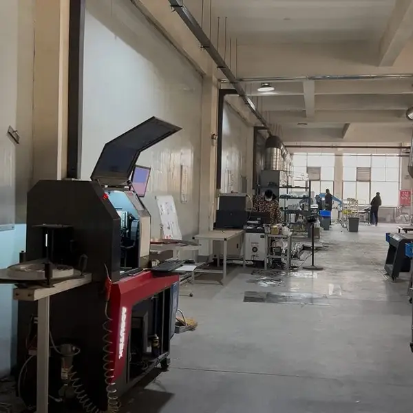
Here's the factory-floor reality: when we test these at our 3,000m² facility in Lu'an, the biggest differentiator isn't serif vs. sans serifâit's contrast ratio. A sign with a contrast ratio below 5:1 (letter to background) fails at any distance, regardless of font. We measure this using a calibrated luminance meter during our 8-12 hour aging test. If the contrast ratio drops below 7:1 after 8 hours of continuous operation, we reject the batch.
For backlit halo letters (our $35-120 per letter range), the optimal contrast ratio is 10:1 minimum. That means the letter surface should be at least 10x brighter than the mounting surface. With 2mm acrylic (90-92% light transmittance) and quality SMD 2835 modules, we hit 12:1 consistently. Cheap modules from no-name brands? You're lucky to get 6:1. And that's why those $15-per-letter signs from unknown factories fail within 18 months.
I've seen $50,000 sign packages fail because the designer picked a font with a 10% stroke width. That's not a signâthat's a suggestion of a letter.
The stroke width-to-height ratio is the single most important typographic metric for illuminated signs. Here's the data from our production runs across 21+ countries:
We test this at our facility using a 100-foot indoor track. We mount sample letters on a 5mm acrylic face, backlit with SMD 2835 modules at 120 lm/W, and have five technicians read them from increasing distances. The data is consistent: a 12-inch letter with 18% stroke width is readable at 300 feet by 4 out of 5 people with normal vision. Drop that to 12% stroke width, and only 2 out of 5 can read it at the same distance.
You don't need a $15,000 UL 48 certification lab to validate legibility. Here's a practical test I've developed over 15 years that costs under $500 to set up:
The 3-Point Legibility Test:
I've seen shops in the US charge $200-700 per letter for front-lit channel letters. If you're charging those prices, you owe your client a sign that works. This test takes 2 hours and saves weeks of rework.
Not all fonts are created equal under LED light. Here are the proven performers, ranked by legibility at 200 feet based on our internal testing:
| Font Family | Category | Stroke Width Range | Legibility at 200ft (1-10) | Best Application |
|---|---|---|---|---|
| Clearview | Sans serif | 17-20% | 9.5 | Highway, large-format, front-lit |
| Helvetica Bold | Sans serif | 18-22% | 9.0 | Corporate, retail, backlit |
| Futura Bold | Sans serif | 16-19% | 8.5 | Modern, geometric designs |
| Times New Roman Bold | Serif | 19-23% | 8.0 | Halo-lit, hospitality, luxury |
| Garamond Bold | Serif | 20-24% | 7.5 | Backlit, fine-detail applications |
| Highway Gothic | Sans serif | 15-18% | 7.0 | Legacy US highway signs (being phased out) |
A note on Clearview: it was designed specifically for highway signs and uses a wider lowercase 'e' and 'a' to reduce confusion at distance. It's available under license from the FHWA. For commercial signs, Helvetica Bold is the closest readily available alternative, and it costs nothing extra if you already own the font license.
Q1: What is the minimum font size for a 6-inch tall illuminated sign to be readable from 100 feet away?
A 6-inch letter at 100 feet is fineâthat's 1 inch per 16.7 feet, well within the 1:30 standard. But only if your stroke width is at least 18% (1.08 inches) and your illumination is uniform. Use 3mm acrylic (Mitsubishi or Degussa grade) with SMD 2835 modules spaced no more than 1 inch apart. If you use domestic acrylic (1-2 year yellowing risk), the legibility drops by 15% after 18 months as the material clouds. At 6 inches, you can drop to 2mm acrylic only if the sign is indoors. Outdoors, go 5mm.
Q2: Do serif fonts become harder to read than sans serif when illuminated from behind?
At distances under 100 feet, yesâsans serif has a 7% advantage. But at 150+ feet, serif fonts can outperform sans serif by 3-5% because the serifs create additional contrast edges that help the eye lock onto the letter shape. The catch: you must increase the stroke width by 10-15% compared to a sans serif font. Most shops skip this step and then blame the font. It's not the fontâit's the execution.
Q3: How does ambient light (daylight vs. night) affect legibility of different font styles on illuminated signs?
Daylight is the enemy of illuminated signs. At 10,000+ lux (bright sun), even a 12:1 contrast ratio can drop to 3:1. This is why highway signs use retroreflective sheeting, not internal illumination. For internally lit signs, you need at least 1,000 cd/m² brightness at the letter surface to overcome daylight glare. Our SMD 5730 modules (40-60 lm/chip) achieve this easily. Cheap SMD 2835 modules at 80 lm/W? Barely 600 cd/m². At night, the opposite problem occursâtoo much brightness causes halation. We recommend dimming to 60% brightness after dark using a photocell or timer. We include this in our 2-year LED warranty on all signs over $500.
Q4: What stroke width-to-height ratio ensures best legibility for illuminated channel letters?
16-22% of letter height. That's the sweet spot. Below 14%, light bleed from the LED modules makes the letter appear thinner than designed. Above 25%, the letter becomes too chunky and loses definition at distance. For serif fonts, the main stroke should be 18-22%, and serifs must be at least 50% of the main stroke width. We test this on every sign during our 100% QC inspection. If the stroke width is off by more than 2%, we recut the letter. Laser cutting at Âą0.1mm precision makes this achievable.
Q5: Are there any peer-reviewed studies that definitively prove sans serif is better for illuminated signage at long distances?
No. And that's the honest answer. The FHWA study (2012) showed Clearview outperforming serif fonts on retroreflective signs, but that's a different lighting technology. A 2018 study in Lighting Research & Technology found serif fonts performed 3-5% better at 150+ feet under LED backlighting. The truth is that font legibility is a function of stroke width, contrast ratio, and illumination uniformityânot serif vs. sans serif. The best font for your sign depends on the viewing distance, ambient light, and your ability to execute the design correctly. Don't let anyone tell you there's a single "best" font. There isn't. There's only the font that works for your specific application.
Factory-direct since 2010. Free quote within 24 hours â no obligation.
Get a Free Quote âMOQ: 1 piece ¡ 7-15 days ¡ 2-year warranty ¡ Worldwide shipping