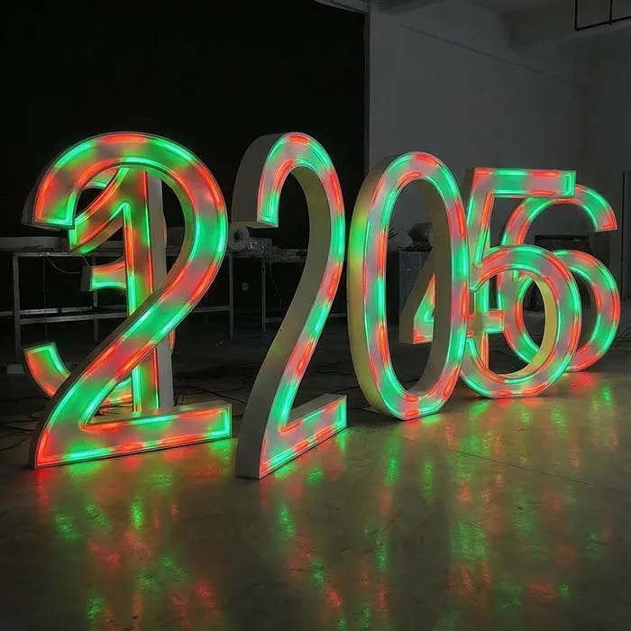
Proper letter spacing for most storefront channel letters lands between 10% and 15% of the letter height.
On a 12-inch letter, that's 1.2 to 1.8 inches between letters. On a 24-inch letter, it's 2.4 to 3.6 inches. Tighter than 10%, and your sign starts to read like a blurred logo at 40 feet. Looser than 15%, and the word breaks apart into disconnected shapes.
Look, I've burned too many nights fixing signs where the spacing looked fine on a 24-inch monitor and then turned into a mess on the storefront.
You're reviewing a 12-foot sign at 400% zoom, so the monitor lies. Spacing doesn't scale linearly in your brain. It scales with angle and viewing distance. If you don't spec it, the factory won't guess for you.
I spec 10–15% of cap height on every quote and production drawing.
For a 10-inch letter, that's 1 to 1.5 inches. For an 18-inch letter, 1.8 to 2.7 inches. That range isn't arbitrary. It's the difference between a sign that reads clean at 60 feet and one that looks like someone scattered alphabet magnets across a metal raceway.
The lower end works for narrow sans serif faces. You need the upper end for wide, bold, or slab-serif faces with heavy strokes. Optical spacing beats mechanical spacing every time.
If you set equal center-to-center distances on letters like "A" and "V", you'll get a gap that looks bigger than "H" and "E". The human eye reads negative space, not math. On front-lit channel letters, that mistake shows up as a visible hole in the word. Factory drawings need kerning notes, not just equal spacing.
Laser cutting holds ±0.1mm. That precision is useless if the layout was wrong. We won't re-cut for free.
Yes. One inch of letter height buys you about 10 feet of legibility.
So if your storefront sits 80 feet from the road, you need at least 8-inch letters. Spacing should scale with that height, not stay fixed at half an inch because it looked cute in the logo.
At 12 inches, spacing of 1.2 to 1.8 inches keeps the word readable at 100 feet. At 6 inches, that same ratio gives you 0.6 to 0.9 inches, but the sign is already too small for a 60-foot setback.
I've seen this go wrong: the landlord's sign band is only 8 inches tall, so the pizza shop owner insists on 6-inch letters. He gets his wish. Six months later, nobody can read the sign from the parking lot, and he's paying for a second set of bigger letters to mount above the awning.
Don't let a tiny sign band dictate your spacing. Fix the letter height first.
Most sign shops don't do a viewing-distance check before quoting. They take the logo file, scale it to fit, and send it. Then the client blames the fabricator when the sign doesn't read from the road.
Yes. Light spreads differently.
Standard front-lit channel letters? 10–15% works. But if you're ordering back-lit halo letters, bump spacing toward the top of that range—sometimes 15–18%. The halo bleeds 1 to 2 inches off the back of each letter. Tight spacing turns that halo into a continuous blob of light. Rookie mistake.
For acrylic LED letters with edge glow—especially side-lit—the glow can merge too. I spec 15% minimum on side-lit if the letters have translucent edges. Our standard 5mm acrylic face transmits 90–92% of light, but that won't save you if the letters blur together at night.
If the sign is dual-lit day and night, you need daylight readability and night readability. Spacing can't be set for just one condition.
If you're doing stainless steel letters without illumination, like 304/316 stainless steel letters, you can go tighter on spacing because light doesn't overlap. But don't go below 8% or the letters will visually collide from a distance.
LED modules matter too. We run SMD 2835 at 100–150 lm/W with L70 ≥50,000 hours. Cheap modules can read 100 lm/W on day one and drop to 50 lm/W in 18 months. Shiny solder joints mean proper lead-free solder. Dull gray joints? A warranty claim waiting to happen.
Most city sign codes don't care about your kerning. They care about total sign area, placement, and whether the sign is internally illuminated. But here's the catch.
If your storefront sign doubles as a permanent room ID sign or accessible entrance sign, ADA standards apply. Tactile signs need a mounting height of 48 to 60 inches, non-glare finish, and Grade 2 Braille. The characters must be specific in style and case, and spacing between characters is part of the readability requirement. Get that wrong on an inspection and you're redoing it.
Most permit rejections happen because the sign area math is off, not because of letter spacing. But if you're doing an accessible sign system, spacing becomes a code issue—not just a design preference.
UL 48 certification doesn't care about your kerning, either. It covers wiring, LED modules, and power supplies. CE marking costs 20,000–50,000 RMB and takes 2–8 weeks. A certificate doesn't mean the sign will read well from the road.
Letter width matters as much as the space between letters.
A 10% gap between two wide, heavy letters can look tighter than the same gap between two narrow letters. Font choice, stroke width, and the shape of adjacent letters all mess with the eye.
The same spacing number doesn't work across all fonts. A tall condensed Gothic can take 8% and still read. A wide slab like Clarendon will look like a traffic jam at 10%.
When I lay out a sign, I print a full-size pattern on the floor before we cut. If the spacing looks wrong in real scale, I don't care what the CAD says. We change it before laser cutting, because after cutting, it's too late.
Our laser cutting holds ±0.1mm. After cutting, we bend, weld, polish, assemble with LEDs, seal with neutral silicone, and run everything through an 8–12 hour aging test. Then 100% QC inspection. You waste that whole process if the spacing was wrong on day one.
I've watched sign shops pay $800 for a front-lit letter from a domestic fabricator. Same 304 stainless, same LEDs. We ship that letter for $120. The difference? We don't let a bad layout leave the floor.
"Can't I just use auto kerning in CorelDRAW?"
Auto kerning is a starting point, not a fabrication spec. Send me a file with auto kerning, and my team still adjusts the spacing on the production drawing. The software doesn't know what a 12-foot sign looks like from a moving car.
"What's the minimum spacing before it looks bad?"
For most sans serif channel letters, 8% is the floor. Below that, the strokes merge into a dark blob. I don't care how cool the font is. Below 8%, you might as well buy a lightbox with a cutout face.
"Does letter spacing change the price?"
No. We price by letter height and quantity, not by how much air you leave between letters. Bad spacing will cost you a new sign after the first one misses the mark.
"Do you need exact spacing on the order?"
Yes. Don't send a napkin sketch and say "make it look good." If you can't provide spacing, we'll spec it at 12% of letter height and note that on the drawing for your approval. After approval, we cut. No changes once the laser hits the sheet.
Products mentioned or relevant to this topic — factory-direct, custom built.
From $24/letter · MOQ 1 piece · Flexible lead time · CE & UL certified · ships to 20+ countries
Custom sizes, colors, and finishes. Get a factory price in 24 hours.
Get a Free QuoteWhatsApp +86 13865703472 · cairuisheng@aochuangsign.cn