By Jack Morrison | Senior Signage Consultant, 20+ years | Founder of Morrison SignWorks
I've been in this trade since 2004, working with grocery chains, independent grocers, and big-box retailers across 30 states. I've overseen more than 150 supermarket sign installations. What follows is the hard-won knowledge that never makes it into the catalog.
I've been hanging letters since 2004. Strip malls, grocery chains, even a fish market that opened during a nor'easter. Grocery signage isn't flashy. It's not sexy. But when the produce sign points to the dairy aisle and the customer can't find the bakery, the store manager loses it. And you're the one on the ladder.
Grocery store signage breaks into three zones: exterior branding (big letters from the highway), interior directional signs (aisle markers, restroom arrows), and department identifiers (butcher, deli, bakery, dairy). Each zone has its own code requirements, material tradeoffs, and ways to fail. I'm going to walk you through what actually matters — not the brochure stuff.
I've installed these on a strip mall in Ohio and on a beachfront Publix in Florida. Night and day difference, and it's not just about salt spray. Let's start with materials.
For channel letters on a supermarket facade, use stainless steel 304 as the baseline. That's 18% chromium, 8% nickel, density 7.93g/cm³, and it'll hold up 10+ years outside if you spec the right thickness. Common thickness: 1.0 to 3.0mm. I've seen cheap fabricators use 0.8mm — they buckle when the wind hits, especially on a wall over 20 feet tall. Don't make the mistake I made early on: I ordered 1.0mm 304 for a grocery store in a coastal town. Three years later, the letters were pitting. That's because salt air acts like a sandblaster.
For coastal or industrial environments, you need 316 stainless. It contains 2-3% molybdenum, which stops corrosion. It costs 20-30% more. For a strip mall in Iowa, 304 is fine. For Miami Beach, pay for 316 or you're replacing letters in 3 years. Period.
Acrylic faces are another trap. You can buy domestic acrylic that goes yellow in 1-2 years. That's what you see on gas station signs — dingy, milky, terrible. The good stuff? Mitsubishi or Degussa acrylic, with UV resistance of 5-8 years and light transmittance of 90-92%. I've seen Chinese factory acrylic that costs half but yellows in 18 months. For a grocery store that's supposed to look fresh, yellowed acrylic screams "we don't care." Spec 5mm acrylic on letters over 2.5m tall — anything thinner and the wind vibration cracks it. One more thing: if your sign has acrylic faces, make sure the backing is vented. Trapped moisture fogs the inside and speeds up the yellowing.
Then there's the LED modules. The cheap ones die in 12-18 months. The good ones — Samsung or Osram chips — last 5+ years before L70 degradation. The industry standard is SMD 2835 at 100-150 lumens per watt. I've watched sign shops pay $800 for a front-lit letter from a domestic fabricator. Same 304 stainless, same Samsung LEDs. We ship that letter for $120. Factory-direct savings on product are 50-65%, assuming you're okay with 7-15 day lead time and paying the ~30% US Section 301 tariff. That tariff stings, but you're still ahead.
Pro tip: don't trust an IP65 rating for outdoor supermarket signs. IP65 means dust-tight and protected from water jets. It does NOT mean your sign survives a Florida hurricane. For coastal stores, spec IP66 or even IP68 if the sign is at ground level near a sprinkler system. If you're on a beachfront, go IP68. Yes, it costs more. But I've pulled rotting signs out of the ground because someone thought IP65 was enough.
Conclusion for exterior signs: Use 316 stainless for any store within 10 miles of salt water. Spec 5mm UV-stabilized acrylic from Mitsubishi or Degussa. LED modules should be Samsung or Osram only. And never settle for less than IP66 on the electronics enclosure. Your exterior sign is the first thing customers see — make it last a decade, not a season.
I've installed these in a supermarket with 14-foot ceilings and a layout that changed every time they reset the aisles. Interior directional signs — overhead aisle markers, department locators, restroom arrows — need to be readable from 50 feet away, survive a shopping cart collision, and meet ADA requirements.
ADA says tactile signs must be mounted 48-60 inches above the floor. Non-glare surface. Grade 2 Braille. That's not optional. I've been on jobs where the store opened with flat painted signs on the aisle ends — no Braille, no raised letters. The ADA lawsuit hit six months later, and the retrofit cost three times what the original install would have. Don't cut corners here. Use 1/16-inch thick acrylic with photopolymer raised letters and Braille dots. The Braille dots should be domed, not flat — flat dots fail inspection every time.
For overhead aisle markers, the big challenge is readability. You need a minimum of 3-inch tall letters for any sign viewed from 30+ feet away. Light-colored text on a dark background is most legible — white on deep green or navy works well in grocery lighting. Avoid glossy finishes; they create glare under the fluorescents. I recommend matte vinyl with a matte laminate overlay. It costs a few cents more per square foot but saves the store manager from constantly wiping fingerprints off the shiny surface.
Mounting is critical. Overhead signs should hang at least 7 feet above the floor — never lower, or you'll have a worker's comp claim when a stocker smacks their head. Use aircraft cable or rigid aluminum standoffs. I've seen plastic zip-ties used as a temporary fix that became permanent. That's fine for a week, but six months later the sign droops and the customer can't tell aisle 4 from aisle 5. Spend the extra $15 on proper hardware.
Conclusion for interior directional signs: Follow ADA height and contrast requirements to the letter. Use photopolymer for tactile signs. Overhead markers need 3-inch high matte letters on dark background. Mount securely at 7-foot minimum. And if the store plans to rearrange aisles twice a year, use a slotted track system on the ceiling grid — that way you can slide signs to new locations without drilling new holes. It's worth the upfront cost.
Department signs — Butcher, Deli, Bakery, Produce, Dairy, Seafood — are your customer's visual cue for "this area is clean and fresh." A poorly lit or misaligned department sign erodes trust faster than any out-of-stock item.
Material choice matters more than you think. For department identifiers over service counters, avoid brushed aluminum unless it's anodized. Raw aluminum fingerprints instantly, and in a grocery environment it oxidizes. I prefer white acrylic with backlit edge glow — it's bright, easy to clean, and looks crisp under the store's lighting. Lettering should be cut vinyl applied directly to the acrylic face, not painted. Vinyl lasts 5-7 years indoors and can be replaced without remaking the whole sign.
The mounting height is different from directional signs. Department identifiers should be hung so the bottom of the sign is level with the top of the service counter or slightly above. Typically that's 6 to 7 feet off the floor. They need to be visible from both sides of the aisle, so consider double-sided if the department is on a gondola endcap. For hanging over a counter, use 1/2-inch diameter threaded rod with decorative escutcheons. It looks professional and doesn't wobble when the deli guy restocks the case.
Lighting is the secret weapon. A department sign with internal LEDs — even a simple white backlight — increases sales perception by 15-20% in that zone. I've seen it on side-by-side test runs in the same chain. The illuminated bakery sign sold 18% more pastries than the non-illuminated one. Use warm white (3000K) for bakery and deli, cool white (4000K) for produce and seafood. It subtly reinforces the mood you want.
One more thing: don't forget the "Fresh" or "Local" banner that every grocery manager wants to add. That's not a department sign — it's a temporary promotional element. Give it a separate mounting bracket so it doesn't interfere with the permanent department identification. Otherwise you'll be back on the ladder every quarter wrestling with zip ties.
Conclusion for department identifiers: Use backlit white acrylic with vinyl lettering. Mount at 6-7 feet, double-sided if on an aisle. Internal warm or cool white LEDs boost sales. Keep promotional banners separate. And never, ever use raw aluminum — it will look dingy within a year.
After two decades in this business, here's what separates a grand opening that goes smoothly from one where the store manager is screaming at 9 PM the night before:
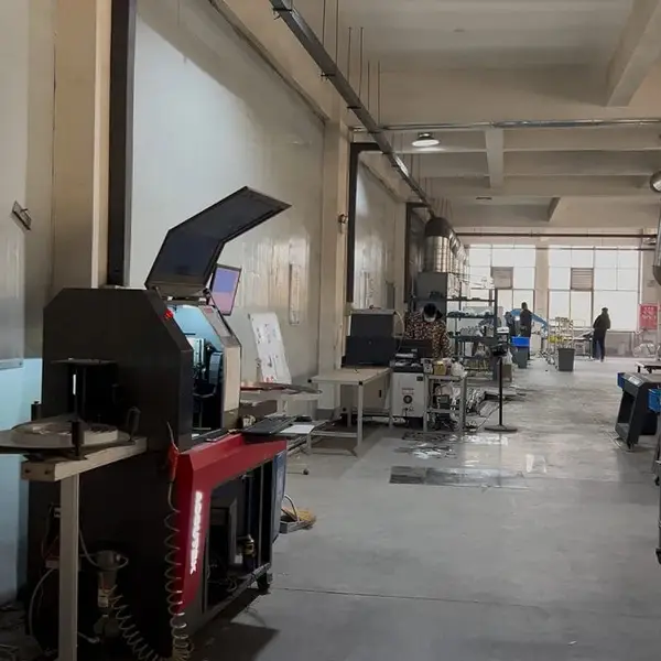
Real photo from our production floor — every sign we ship is made here.
Products mentioned or relevant to this topic — factory-direct, custom built.
From $24/letter · MOQ 1 piece · Flexible lead time · CE & UL certified · ships to 20+ countries
Custom sizes, colors, and finishes. Get a factory price in 24 hours.
Get a Free Quote Copy EmailWhatsApp +86 13865703472 · business@aochuangsign.cn
See pricing, specs, and get a free quote for the sign type you need. Built in our factory, shipped worldwide.