Design Principles • Brand Integration • Sizing • Materials • Illumination • Compliance
Here's a number that should make every business owner pay attention: 76% of consumers have entered a store they'd never visited before based solely on its signage. Another study found that 68% of consumers believe a business's signage reflects the quality of its products or services. Your sign isn't decoration — it's the most cost-effective advertising you'll ever buy.
Think about the math. A $3,000 storefront sign that lasts 10 years costs $0.82 per day. It works 24 hours a day, 365 days a year — while you're closed, while your team is asleep, while your digital ads are turned off. No other marketing channel comes close to that cost per impression.
But a sign only does that job if it's designed right. Poorly designed signage — wrong size, bad contrast, illegible fonts — actually costs you money. Every car that drives past without noticing your sign is a potential customer who didn't stop. Every pedestrian who squints and can't read your business name is revenue lost.
Factory insight: After 15 years of manufacturing signs, we've learned that the biggest design mistakes aren't aesthetic — they're functional. A sign that's too small for its viewing distance, a font that washes out when illuminated, colors that disappear at dusk. Design for function first, and beauty follows.
When someone looks at your storefront, their eye follows a predictable path. Good design works with this natural scanning behavior — bad design fights it and loses.
You have roughly 3 seconds to communicate who you are to someone driving or walking past. In those 3 seconds, a well-designed sign should answer three questions:
Elements on a sign should be sized according to their importance:
| Element | Visual Weight | Typical Size % |
|---|---|---|
| Business name / logo | Highest | 60-70% of sign area |
| Category descriptor | Medium | 15-20% of sign area |
| Tagline / phone / website | Lowest | 10-15% of sign area |
Every additional element you add dilutes the impact of everything else. The best storefront signs have exactly two elements: the business name and the category. Everything else is noise.
Your sign shouldn't match your brand — it should be your brand, in three dimensions. Every design decision — font, color, material, illumination, mounting — communicates something about who you are.
| Material | Brand Signal | Best For |
|---|---|---|
| Brushed stainless steel | Established, trustworthy, premium | Law firms, banks, corporate HQ |
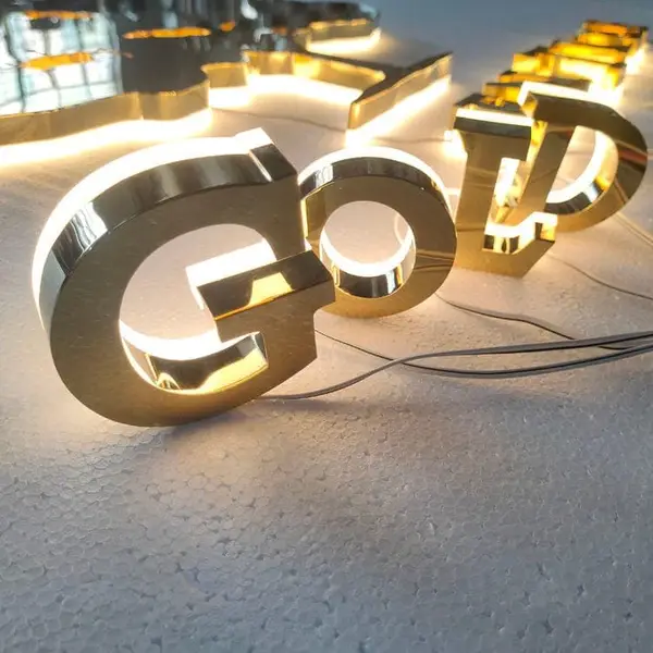
| PVD gold/rose gold finish | Exclusive, luxurious, aspirational | Luxury retail, high-end salons, jewelry |
| Powder-coated aluminum | Modern, clean, approachable | Tech startups, medical offices, cafes |
| Weathered brass/copper | Heritage, authenticity, craftsmanship | Craft breweries, barbershops, historic hotels |
| Backlit acrylic | Bright, welcoming, value-oriented | Retail chains, pharmacies, fast casual |
Your storefront sign shouldn't exist in isolation. The same font, color palette, and material language should carry through to your window graphics, interior signage, menu boards, and even your website. When a customer walks from the parking lot to the counter, every sign they encounter should feel like it came from the same brand.
Sign size isn't a design preference — it's physics. The formula used by professional sign shops worldwide:
| Scenario | Viewing Distance | Minimum Letter Height | Recommended Height |
|---|---|---|---|
| Pedestrian sidewalk sign | 10-20 ft | 2-3 inches | 4-6 inches |
| Strip mall storefront | 40-80 ft | 6-8 inches | 10-14 inches |
| Main street retail | 80-150 ft | 10-12 inches | 18-24 inches |
| Shopping center anchor | 200-350 ft | 18-24 inches | 30-36 inches |
| Highway/pylon sign | 400-600+ ft | 36+ inches | 48-60 inches |
Here's something most design guides won't tell you: signs look 20-30% smaller when installed than they do on a proof. This is called the "scale illusion" — a 24-inch letter looks substantial on your computer screen but small against a 20-foot facade. When in doubt between two sizes, always go with the larger one. Nobody ever complained that their sign was too easy to read.
Font choice isn't just aesthetics — it directly affects readability, fabrication cost, and long-term durability.
Minimum stroke width should be approximately 1/8 of letter height. Below this ratio, the letter looks spindly, doesn't provide enough structure for mounting hardware, and may not have enough interior space for LED modules in illuminated signs.
Color in signage serves two masters: brand identity and legibility. When they conflict, legibility wins. A sign that matches your brand perfectly but can't be read from 50 feet away is a failure.
The single most important factor in sign legibility is contrast between the letters and their background. Dark letters on a light background consistently outperform the reverse. Here's the hierarchy from best to worst:
A sign that looks perfect during the day can become illegible at night. Front-lit channel letters reverse their contrast: dark letters on a light building become bright letters on a dark background after sunset. This is actually good — bright letters against a dark sky are more visible. But back-lit (halo) signs don't reverse — they rely on the halo effect against the mounting surface, which works in both day and night conditions.
Most premium signs use two or more materials working together. The skill is in knowing which combinations work — and which fight each other.
| Primary Material | Pair With | Effect | Best Application |
|---|---|---|---|
| Brushed SS 304 face | Aluminum returns, warm white halo LEDs | Warm premium, soft glow | Corporate lobbies, law firms |
| PVD gold SS face | Black powder-coated returns | Ultra-luxury contrast | Jewelry stores, luxury boutiques |
| Clear acrylic face | Brushed aluminum returns | Modern, clean, bright | Tech offices, medical clinics |
| Weathered brass | Dark bronze accents | Heritage, old-world quality | Historic buildings, craft bars |
| Matte black powder coat | Brushed SS standoffs | Sleek minimalist contrast | Modern retail, galleries |
Galvanic corrosion warning: When two different metals touch in the presence of moisture, one will corrode faster. Stainless steel touching aluminum = aluminum corrodes. Always use nylon isolation washers between dissimilar metals in outdoor installations.
Illumination isn't binary (lit vs unlit) — it's a spectrum of strategies, each with different visual effects and costs.
| Method | Visual Impact | Cost Impact | Energy Use | Best For |
|---|---|---|---|---|
| Front-lit channel letters | Highest readability | Baseline | Medium | Retail, restaurants, high-traffic areas |
| Back-lit / Halo | Highest prestige | +15-25% | Medium | Corporate, luxury, professional services |
| Combination (front+back) | Maximum impact | +30-50% | Higher | Flagship stores, entertainment venues |
| Edge-lit only | Subtle, modern | +10-15% | Low | Interior, tech offices |
| Non-illuminated | Daytime only | Lowest | None | Secondary signs, indoor only |
| Exposed LED / punch-hole | Maximum brightness | +10-20% | Higher | Rooftop, highway, 300ft+ viewing |
A sign doesn't float in space — it exists on a specific building with specific architecture. The best sign designs feel inevitable, like they grew out of the building itself.
A sign should be proportional to the architectural element it's mounted on — not the entire building. A 30-story building doesn't need a 30-foot sign; it needs a sign proportional to the entrance portal, which might be only 12-15 feet tall. The sign competes with the doorway, not the skyline.
Every city has its own sign code. Here's what you need to know before you design — because a sign that violates code is a sign you can't install.
Critical timing: Permitting takes 2-6 weeks in most cities. Start the permit application the day you place your sign order — don't wait for the sign to arrive. We provide spec sheets and mounting details that satisfy most building department requirements.
Different industries have different signage conventions — and deviating from them carries risk. A law firm with neon signage sends the wrong message. A nightclub with conservative brass letters does too.
| Industry | Recommended Type | Material | Illumination | Color Temp |
|---|---|---|---|---|
| Law Firm | Halo-lit individual letters | Brushed SS 304 | Back-lit halo | 4000K |
| Medical / Dental | Front-lit channel letters | White acrylic + aluminum returns | Front-lit | 5000K |
| Restaurant (Fine Dining) | Halo-lit + accent lighting | SS 304, brass accents | Back-lit halo | 3000K |
| Restaurant (Fast Casual) | Front-lit channel letters | Colored acrylic face | Front-lit | 4000K |
| Retail (Luxury) | Halo-lit SS letters | PVD gold/black SS 304 | Back-lit halo | 3000-3500K |
| Retail (General) | Front-lit channel letters | Acrylic face + aluminum returns | Front-lit | 4000-5000K |
| Hotel / Hospitality | Monument + building letters | Brass, bronze, SS 304 | Back-lit + landscape lighting | 3000K |
| Bank / Finance | Halo-lit individual letters | Brushed SS 304 | Back-lit halo | 4000K |
| Tech / Startup | Edge-lit acrylic or mini letters | Aluminum, acrylic | Edge-lit or front-lit | 5000-6500K |
Signage trends move slower than graphic design trends — a sign that looked cutting-edge in 2018 shouldn't look dated in 2026. Here's what's working now and has staying power:
| Mistake | Result | Fix |
|---|---|---|
| Letters too small | Can't read from the street. Business invisible. | Use the 1"=10ft formula. Then add 20%. |
| Low contrast | Letters blend into building. Wasted investment. | Dark on light, or light on dark. Test at dusk. |
| Too much information | No single element stands out. Sign is wallpaper. | Two elements max: name + category. |
| Wrong font for fabrication | Thin strokes break. Serifs snap off. Costs double. | Bold sans-serif. Min stroke = 1/8 letter height. |
| No illumination | Business invisible after 5pm. 50% of potential customers. | If you're open past dark, light it. |
| Ignoring sign code | Sign can't be installed. Money wasted. Project delayed. | Check code before design. Start permit early. |
| Designing on screen only | Sign looks 30% smaller installed. Scale illusion. | Mock up at full size with cardboard. Seriously. |
| Matching interior design, not exterior | Sign designed for lobby feels wrong on brick facade. | Design for the exterior wall it lives on. |
Use the formula: 1 inch of letter height per 10 feet of viewing distance. Measure from where your customers first need to read the sign — for a storefront on a 35mph road, that's typically 100-150 feet, so 10-15 inch letters minimum. For a highway-facing sign, 36+ inches. And always add 20% to whatever number the formula gives you — signs look smaller installed than on paper.
Bold sans-serif. Helvetica, Arial, Gotham, and Futura are the industry standards for good reason. Thick, consistent strokes are readable at distance, easy to fabricate, and don't go out of style. Avoid thin script fonts for anything that needs to be read from more than 20 feet away.
If your business is open after dark, yes. An unilluminated sign is invisible after sunset. LED illumination adds 20-40% to the sign cost but gives you 24/7 visibility. The energy cost is negligible — a typical 6-letter LED channel letter sign uses less electricity than a 60W light bulb.
Three strategies: go bigger (within code limits — most businesses undersize their signs), use better illumination (halo-lit signs stand out in a row of front-lit signs, and vice versa), or use premium materials (brushed stainless steel next to painted aluminum is immediately noticeable). Don't try to stand out with unusual colors or fonts — that usually backfires.
Design and fabrication: 7-15 days. Permitting: 2-6 weeks (varies dramatically by city). Shipping: 2-35 days depending on method. Installation: 1-3 days. Total timeline: 4-12 weeks. The permit is almost always the bottleneck — start it first.
For small, non-illuminated signs at ground level: yes, many business owners DIY. For illuminated signs, elevated installations, or anything requiring a permit: hire a licensed sign contractor. The permit typically requires a licensed installer, and the electrical work must meet code. We provide full-size paper templates and wiring diagrams to make the installer's job straightforward.
Send us your logo or just tell us about your business. We'll create a design proposal with size recommendations, material options, and a detailed quote — within 24 hours.
Get a Free Design Consultation → Copy EmailIncludes free 3D preview • 7-15 day production • Worldwide shipping
Explore specific topics from this guide in depth — each article is a comprehensive 1,500–2,500 word resource written by our factory experts.
Dive deeper with these in-depth articles from our factory floor.